How to Design an Industrial Kitchen That Doesn't Feel Cold
The problem is not the aesthetic. The industrial kitchen, done properly, is one of the most resolved and satisfying interiors available to a London homeowner, particularly in the converted warehouses, loft apartments and period properties of East London where the architecture already speaks the same language. The problem is that most people stop at the matte black cabinetry and call it done.
They haven't finished. They've barely started.
This is a guide to doing it properly, illustrated by a Shoreditch loft kitchen that Studio Akiva designed to prove, conclusively, that industrial and warm are not opposing forces. They are, in the right hands, the same thing.
The Core Problem: What "Industrial" Actually Means
Before fixing something, it helps to understand what's going wrong. The industrial aesthetic draws its vocabulary from factories, warehouses and working spaces environments that were designed for function rather than comfort, and that derived their beauty from honesty about materials and structure. Exposed brick. Raw concrete. Steel. Dark metal. The absence of ornament.
Applied literally to a domestic kitchen, this vocabulary produces spaces that feel cold because they are cold. The warmth in an original warehouse — the patina of age, the quality of natural light through large industrial windows, the sheer scale of volume cannot be replicated by painting your cabinets black and buying a Crittall screen.
What can be replicated is the character of those spaces: the drama, the material honesty, the sense that nothing is there by accident. Achieving that in a domestic kitchen while also making it a genuinely pleasant place to spend time requires one thing above all others: contrast.
The Principle: Every Dark Needs a Light
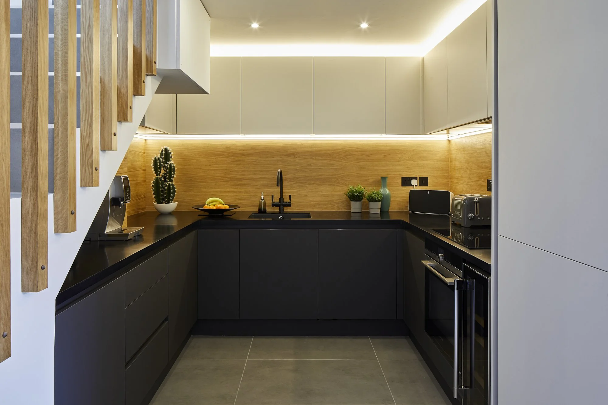
The Shoreditch loft kitchen that Studio Akiva designed for a client in E2 is built around a simple but unbreakable principle: for every element that reads as hard, dark or industrial, there must be a corresponding element that reads as warm, light or organic.
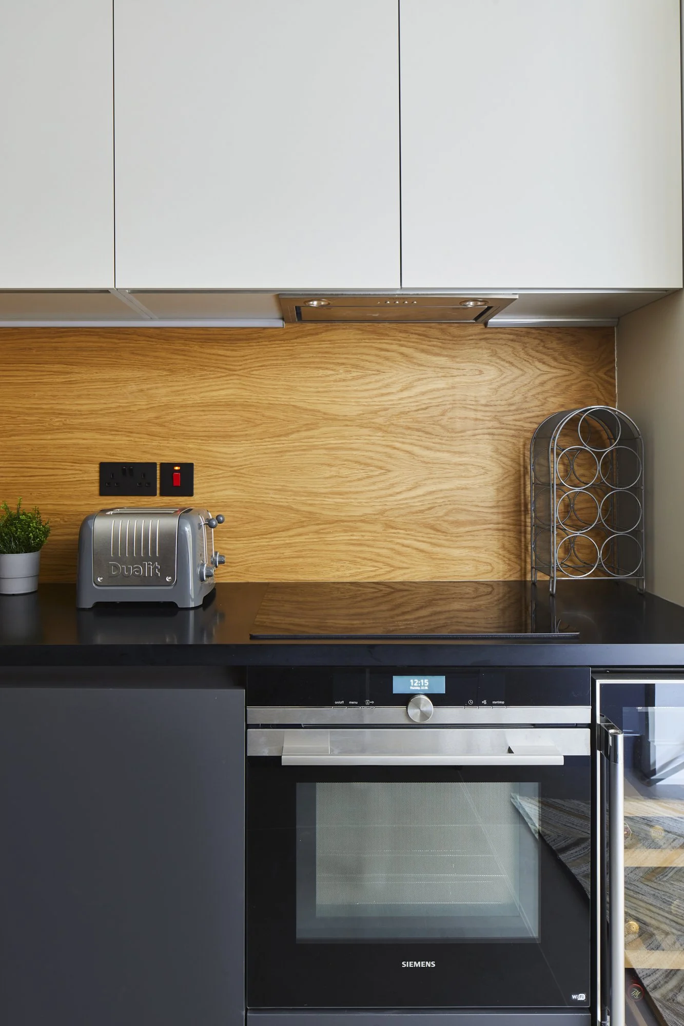
The matte black lower cabinetry — handleless, matte-finish, uncompromising, is the industrial anchor. It establishes the scheme's character immediately and without apology. But it is not the dominant material in the room. That distinction belongs to the oak splash back running the full length of the back wall, from counter to upper cabinet, in a warm honey grain that absorbs and softens everything around it.
Remove the oak and you have a dark, hard kitchen. Keep it, and you have something considerably more interesting: a space with genuine tension between its industrial ambitions and its domestic warmth, resolved in favour of both.
This is the principle. Everything else is application.
The Splashback Is the Most Important Decision in the Room
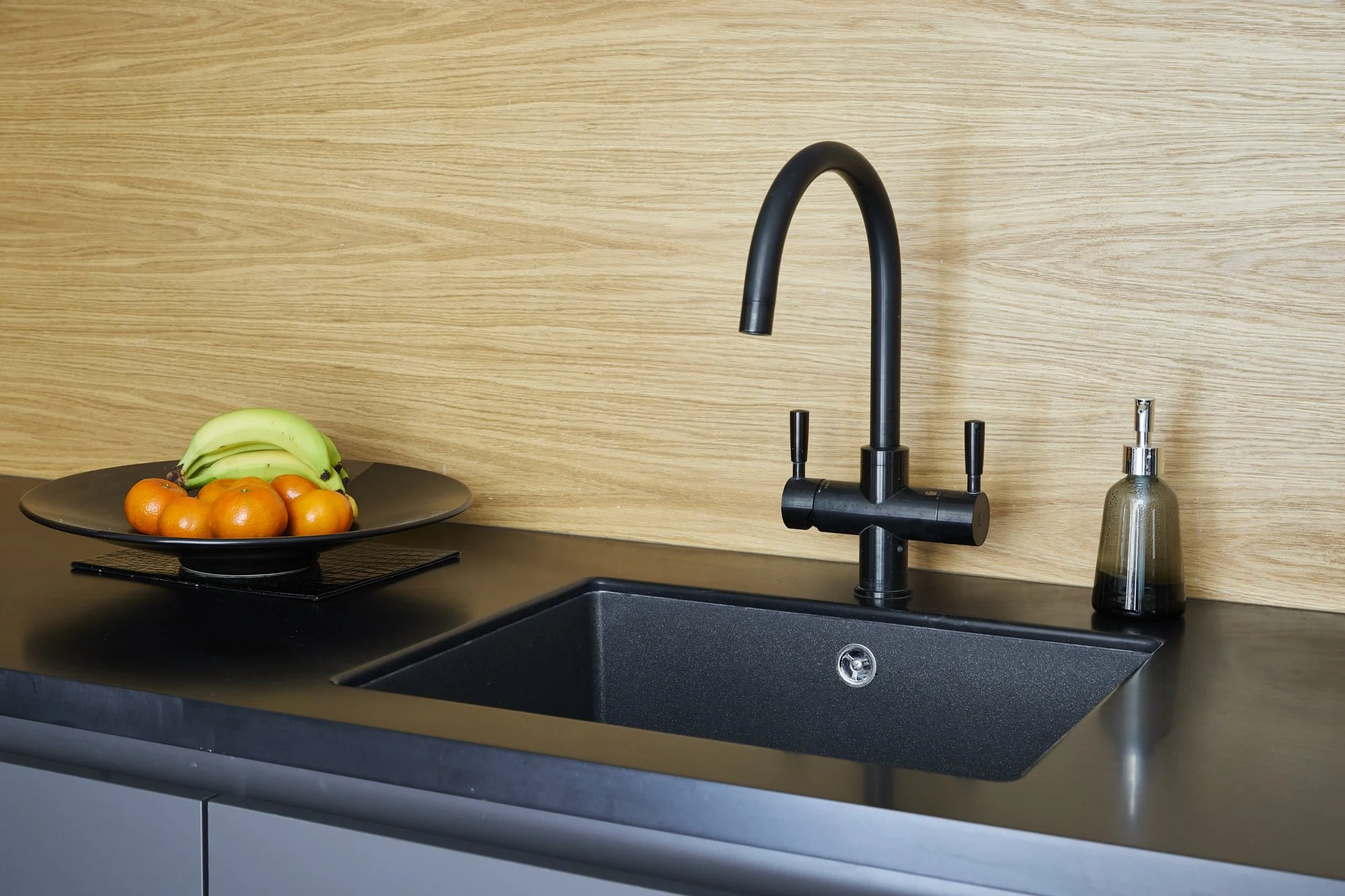
Most kitchen design conversations begin with cabinetry colour and end with worktop material. The splash back is treated as an afterthought, the thing you fill the gap with once the real decisions have been made. This is precisely backwards.
In an industrial kitchen, the splash back is the largest continuous surface behind the main work zone. It sits at eye level. It is what you look at when you're standing at the hob or the sink. In terms of sheer visual impact per square metre, nothing in the room comes close.
In this kitchen, the splashback is full-height oak, running from the worktop to the underside of the upper cabinets, and from one end of the run to the other. It is warm where the cabinets are cold. It is textured where the worktop is smooth. It is natural where the fittings are fabricated. Against a matte black tap and under mount sink, it provides exactly the contrast the scheme needs to breathe.
The alternatives, metro tiles, plain painted plaster, even polished concrete, would all have pushed the kitchen further into the cold. Oak pulled it back. Decisions like this are why the best industrial kitchens look the way they do, and most industrial kitchens do not.
The Two-Tone Cabinet Strategy
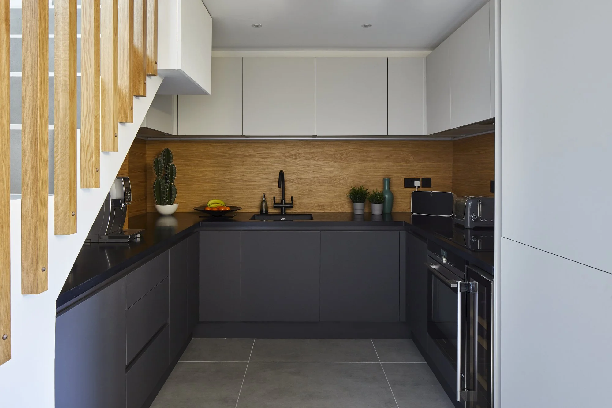
A common mistake in industrial kitchen design is to run the same dark cabinet finish from floor to ceiling. The reasoning is understandable, consistency, drama, commitment to the aesthetic. The result is a kitchen that feels like a tunnel.
The solution is the two-tone approach: dark below the worktop, light above. In this Shoreditch kitchen, the lower units are matte black. The upper cabinets are pale grey not white, which would have felt too stark, but a soft warm grey that sits comfortably between the black below and the oak splash back behind. The ceiling is pale. The walls above the cabinets are pale.
The effect is that the eye reads the dark elements as grounded and deliberate, a foundation rather than an overwhelming presence, while the upper half of the room remains airy and open. The kitchen feels anchored rather than enclosed. The industrial character is concentrated where it is most effective: at counter level, where you interact with the space, rather than above eye line, where it would simply oppress.
If you take one structural decision from this piece, let it be this one.
Lighting: The Detail That Changes Everything
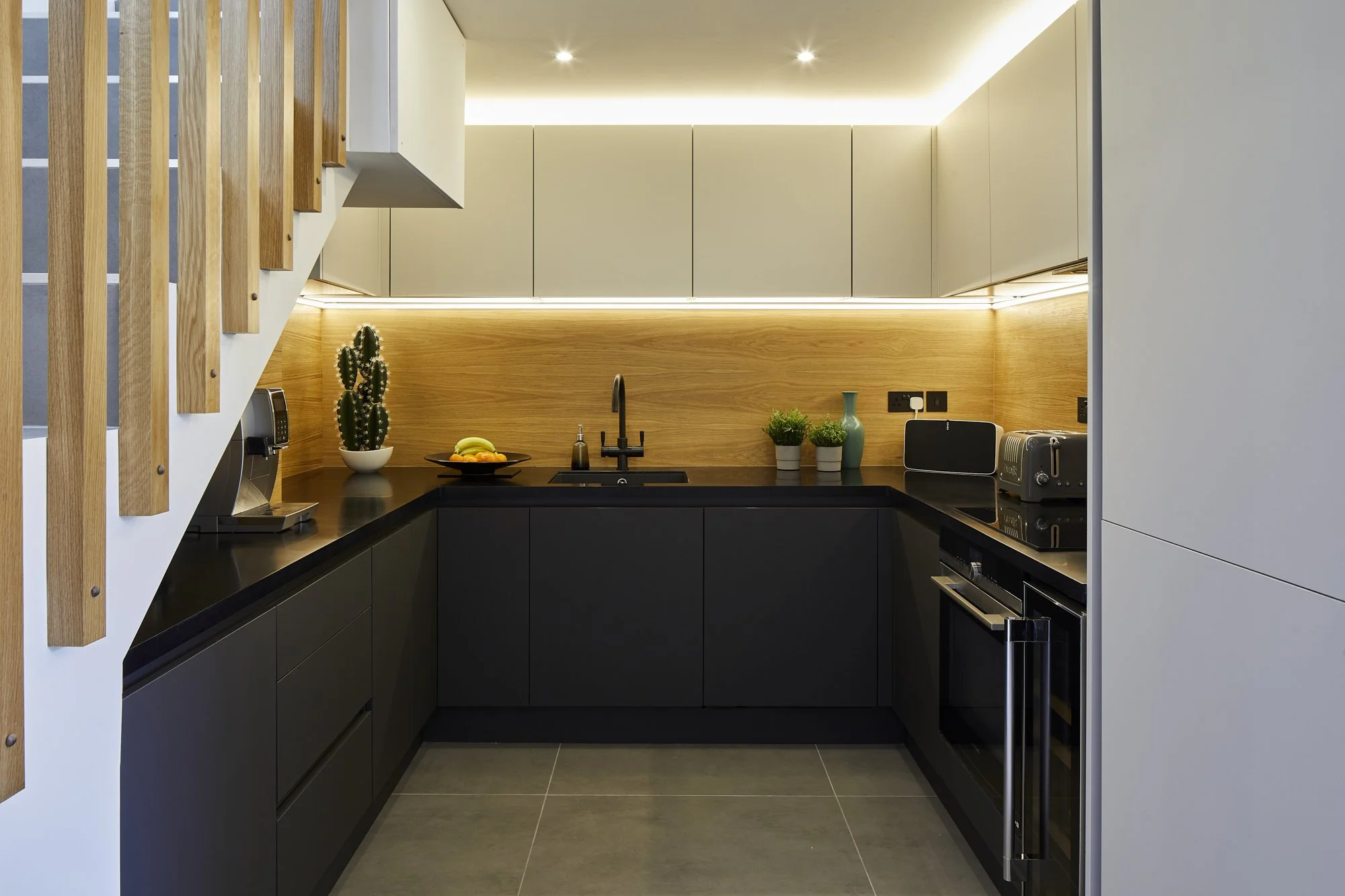
The second photograph in this piece, the kitchen by night, illustrates something that no amount of written explanation can quite replicate: what a properly designed lighting scheme does to a dark kitchen.
The LED strips running under the upper cabinets throw warm light directly onto the oak splashback, turning it from a background element into the focal point of the room. The ceiling coffer lighting adds a layer of ambient warmth above. The kitchen at night is not the same kitchen as the kitchen by day. It is warmer, more atmospheric, more resolved and it achieves this without a single additional design element. The same materials, the same palette, a completely different character.
This does not happen when you buy kitchen lights from the same supplier as your cabinets and call it done. It happens when someone designs a lighting plan, considers the direction, temperature and intensity of each light source, and how they interact with the specific materials in the specific space.
In a dark kitchen, lighting is not a finishing touch. It is structural. Treat it accordingly.
The practical specifics:
-
Colour temperature matters enormously. Warm white (2700–3000K) is what makes a dark kitchen feel welcoming rather than clinical. Cool white (4000K+), which is common in budget LED strips, will make even the warmest materials read cold.
-
Under-cabinet lighting should be continuous, not spotlit. Gaps in the strip create shadows that read as unfinished.
-
Consider a ceiling coffer if the kitchen's proportions allow it. The indirect light it produces is softer and more flattering than recessed downlights alone.
Fitting Consistency: The Rule Nobody Tells You
There is a particular design crime that afflicts otherwise well-intentioned industrial kitchens, and it is this: the matte black cabinetry, the dark worktop, the considered splash back, and then, in the middle of it all, a chrome tap.
Chrome is not inherently wrong. In certain kitchens, it is exactly right. In an industrial kitchen built around a dark palette, it introduces a note of inconsistency that the eye registers immediately, even if the brain cannot quite identify why the room feels slightly off.
In this kitchen, every fitting, tap, sink, switch plates, oven handle, is matte black or dark metal. Not because chrome was forbidden but because every element was considered in relation to every other element, and chrome did not serve the scheme.
This level of fitting consistency is easy to achieve and almost universally overlooked. The tap is a purchase decision that most people make in isolation, on a plumbing supplier's website, without the kitchen design in front of them. It should be made last, with the whole scheme resolved, and it should be made with the same rigour as the cabinet colour.
The Floor: Underrated, Underdiscussed
The floor in this kitchen is a large-format concrete-effect tile in a warm mid-grey. It is not the most glamorous element in the room. It is also not trying to be. Its job is to provide a neutral, continuous ground that connects the space to the rest of the apartment without competing with the cabinets, the splash back or the worktop.
A few principles worth keeping:
Go large-format. Small tiles in an industrial kitchen read as fussy. Large-format tiles 60x60cm or larger, provide the clean, uninterrupted surface that the aesthetic demands. Fewer grout lines, more visual calm.
Avoid high-gloss. A polished floor reflects light in ways that can make dark cabinetry look even darker. A matt or satin finish is more forgiving and more authentic to the industrial reference.
Concrete-effect over actual concrete. Poured concrete floors are the purist choice and the impractical one. Concrete-effect porcelain achieves the same visual result with none of the maintenance requirements of actual concrete, which stains, cracks and needs regular sealing. In a London kitchen, this is not a compromise. It is a sensible decision.
The Under-Stair Opportunity
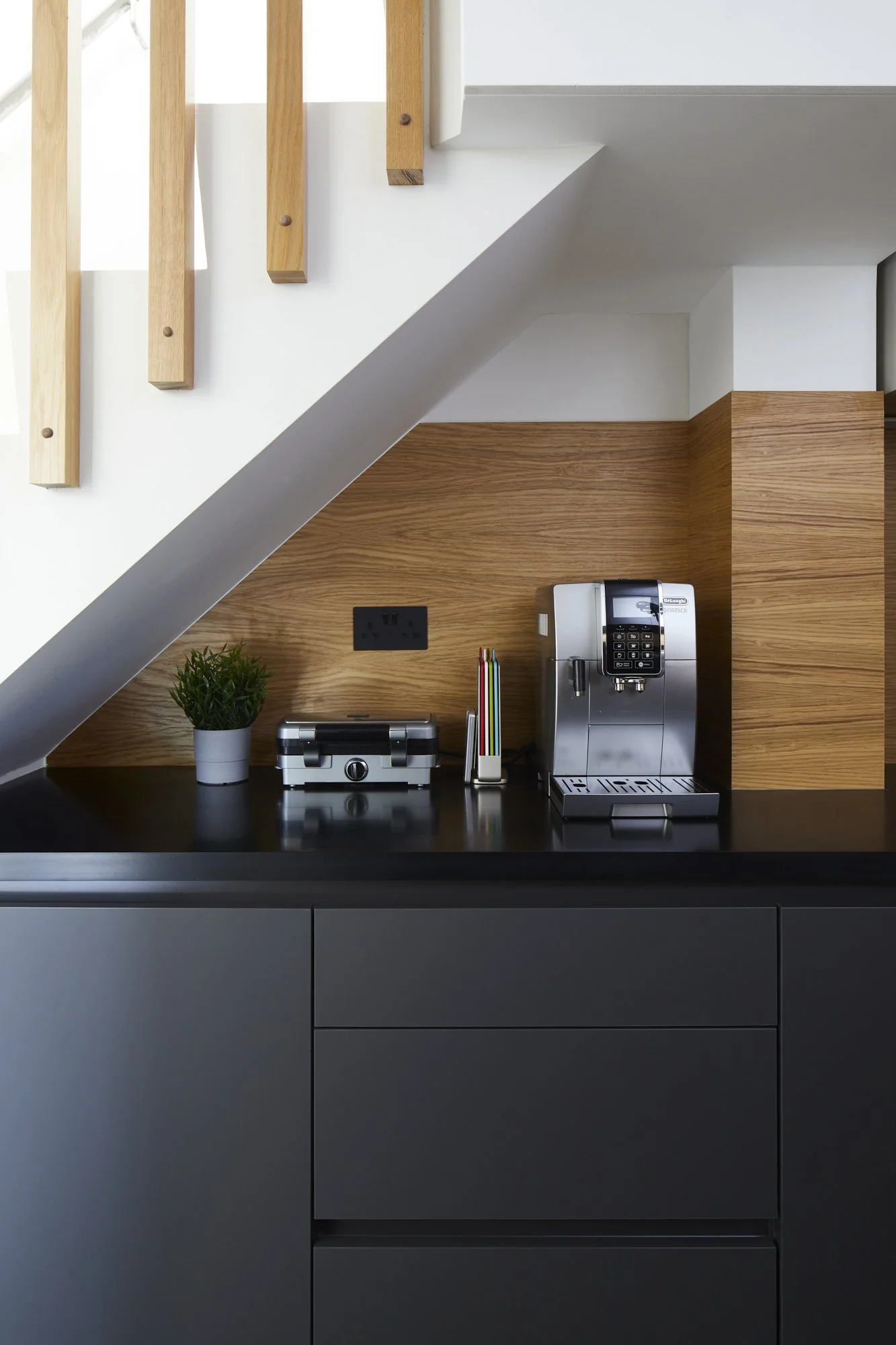
This is a detail specific to loft apartments and open-plan ground-floor spaces, but worth noting because it illustrates a broader point about industrial kitchen design: dead space is a design opportunity.
In this apartment, the area beneath the staircase, typically wasted, sometimes used for coats and clutter, has been resolved into a counter zone with matte black drawers, an oak panel and a dedicated appliance run. It continues the kitchen's material language into the adjacent space, extends the usable counter area, and eliminates a zone that would otherwise have disrupted the visual flow between the kitchen and the dining area.
Industrial design, in its original context, was defined by the productive use of every available space. The best domestic interpretations of the aesthetic carry that principle through.
The Mistake List: What to Avoid
For the sake of clarity, a summary of the decisions that most commonly derail an industrial kitchen:
Going dark on all four walls. The industrial aesthetic concentrates its darkness in the cabinetry and fittings. Walls, ceiling and upper space should remain light. This is not a compromise; it is how the scheme works.
Choosing the wrong LED colour temperature. Cool white strips in a dark kitchen are the single quickest way to make a beautiful scheme feel like a car showroom. Always specify warm white.
Overlooking the splash back. If you have invested in serious cabinetry and a quality worktop, the splash back is not the place to economise. It is the place where warmth either enters the room or doesn't.
Buying fittings in isolation. Tap, sink, handles, switch plates, appliance finishes, these should be specified together, with the whole palette in front of you, not ordered separately from different suppliers over the course of a renovation.
Confusing 'industrial' with 'minimal'. Industrial interiors are not minimalist. They are materially rich, concrete, timber, metal, brick, with warmth built in through texture and contrast. A kitchen that is merely dark and handleless is not industrial. It is under designed.
In Summary
An industrial kitchen that doesn't feel cold is not a contradiction. It is the only version worth having. The elements that make it work, a warm natural material as counterpoint to the dark palette, a two-tone cabinet strategy that keeps the upper half of the room light, a lighting plan designed for the specific materials in the space, fitting consistency that the eye reads even when the brain doesn't, are neither expensive nor complicated. They are simply deliberate.
The Shoreditch loft kitchen shown throughout this piece was designed by Studio Akiva as part of a full apartment renovation. It is a useful illustration of what these principles look like in practice, in a real London home, rather than in a showroom designed to photograph well under controlled conditions.
If you are planning an industrial kitchen in London and want to talk through the design the palette, the materials, the lighting, the details — start that conversation here.
The full Shoreditch loft project, including all rooms, is here.