How Do You Redesign a Home Inside a Grade II Listed Building? This London Duplex Has the Answer
Listed buildings are not like other projects. The architecture is not a neutral backdrop for the interior, it is the subject. The wrought iron beams, the double-height volumes, the original glazed tiles, the towering sash windows: these are the things that make the property what it is. Treat them carelessly and you have a renovation that costs a great deal of money while destroying the thing that justified the investment. Treat them reverently but without imagination and you have a museum rather than a home.
The Kingsway is a converted Grade II listed boarding school in London, now a residential development of some considerable distinction. The apartment that Studio Akiva was commissioned to redesign is a duplex set within its original fabric: high ceilings, wrought iron beams, double-height volumes, original glazed tiles at dado level, tall sash windows that flood the space with north London light. The bones were extraordinary. The interior, before intervention, was failing to acknowledge them in almost every respect.
What followed was a renovation that makes a persuasive case for how heritage architecture and contemporary domestic life can not merely coexist but actively enhance each other.
Before: A Duplex That Couldn't See What It Had
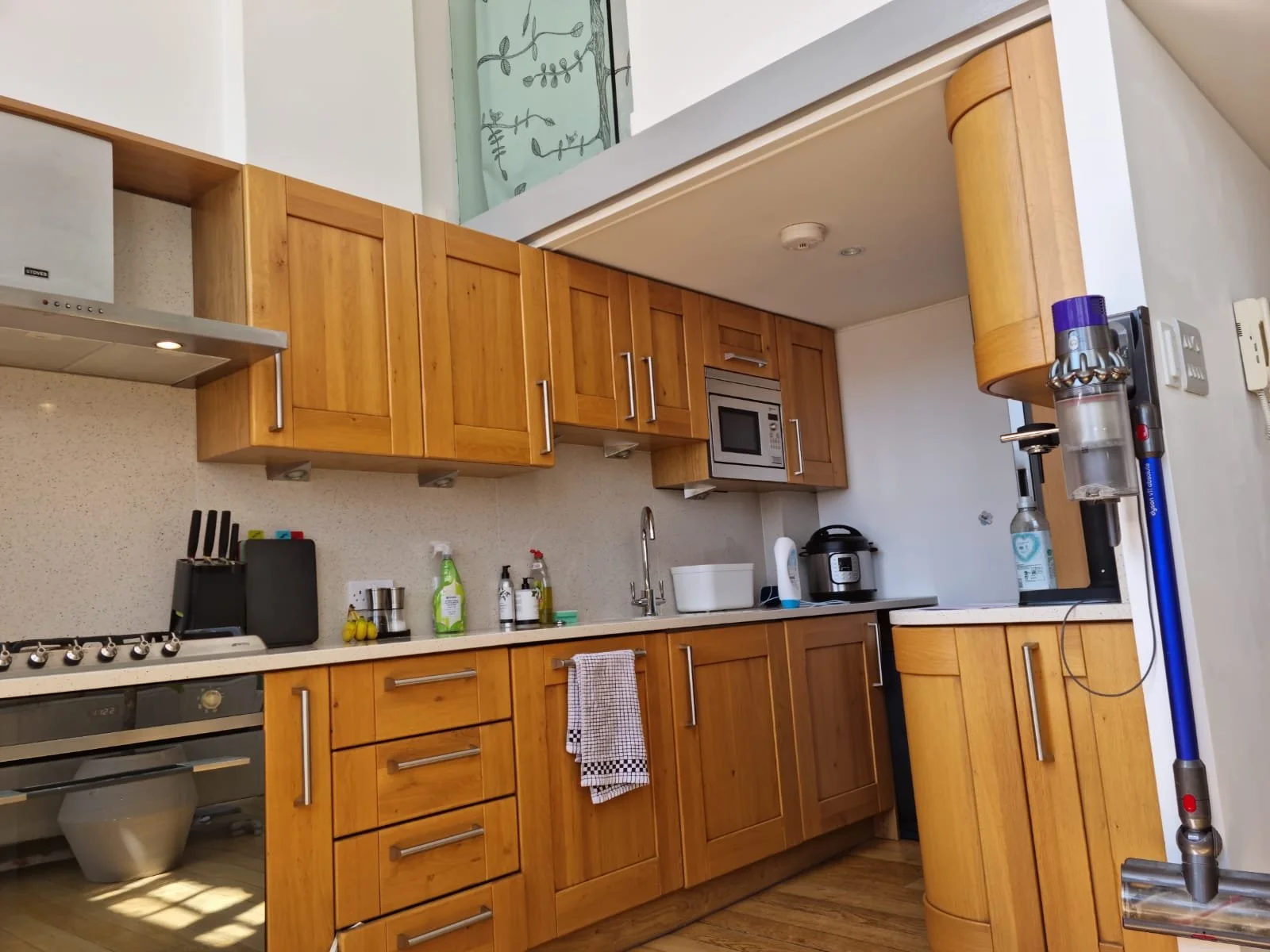
The before photographs tell the story of a flat that was, in the most straightforward sense, not listening to its building. The double-height sash windows, remarkable features in any London property, were framed by dated pine shaker cabinets with chrome bar handles and a speckled granite-effect worktop that belonged in a different decade and a different building entirely.
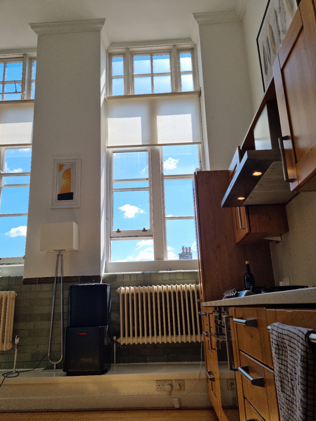
The kitchen was functional and wrong. The double height above it, with the building's original cornice and sash glazing, was completely unacknowledged. A portable heater sat on the floor. Wires trailed along the skirting. The bones were extraordinary; the execution was indifferent.
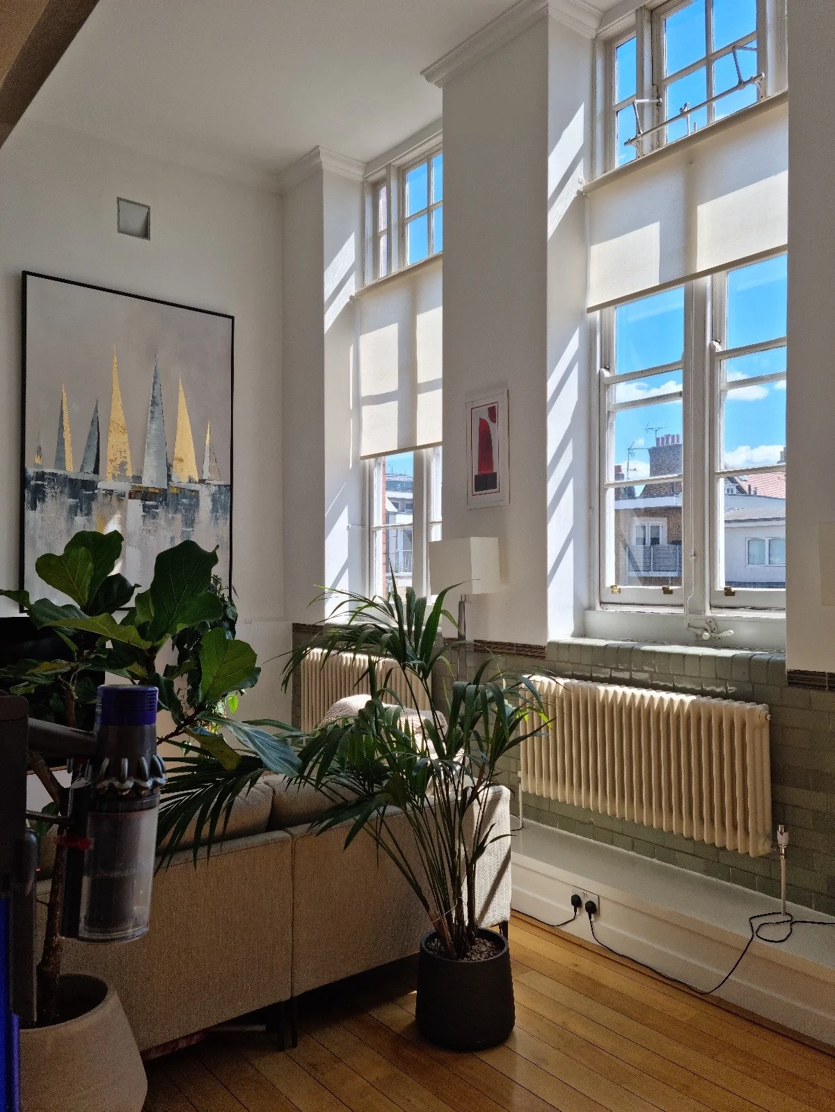
The living room had the same problem at larger scale. The original column radiators were cream and untreated. The glazed sage dado tiles, a genuinely beautiful heritage detail, were acknowledged only by their presence, not by any design decision made in relation to them. The television sat on a basic shelf against a plain white wall. The sailboat artwork, which would later hang magnificently in the double-height finished space, was propped against the wall at standard residential height, stranded.
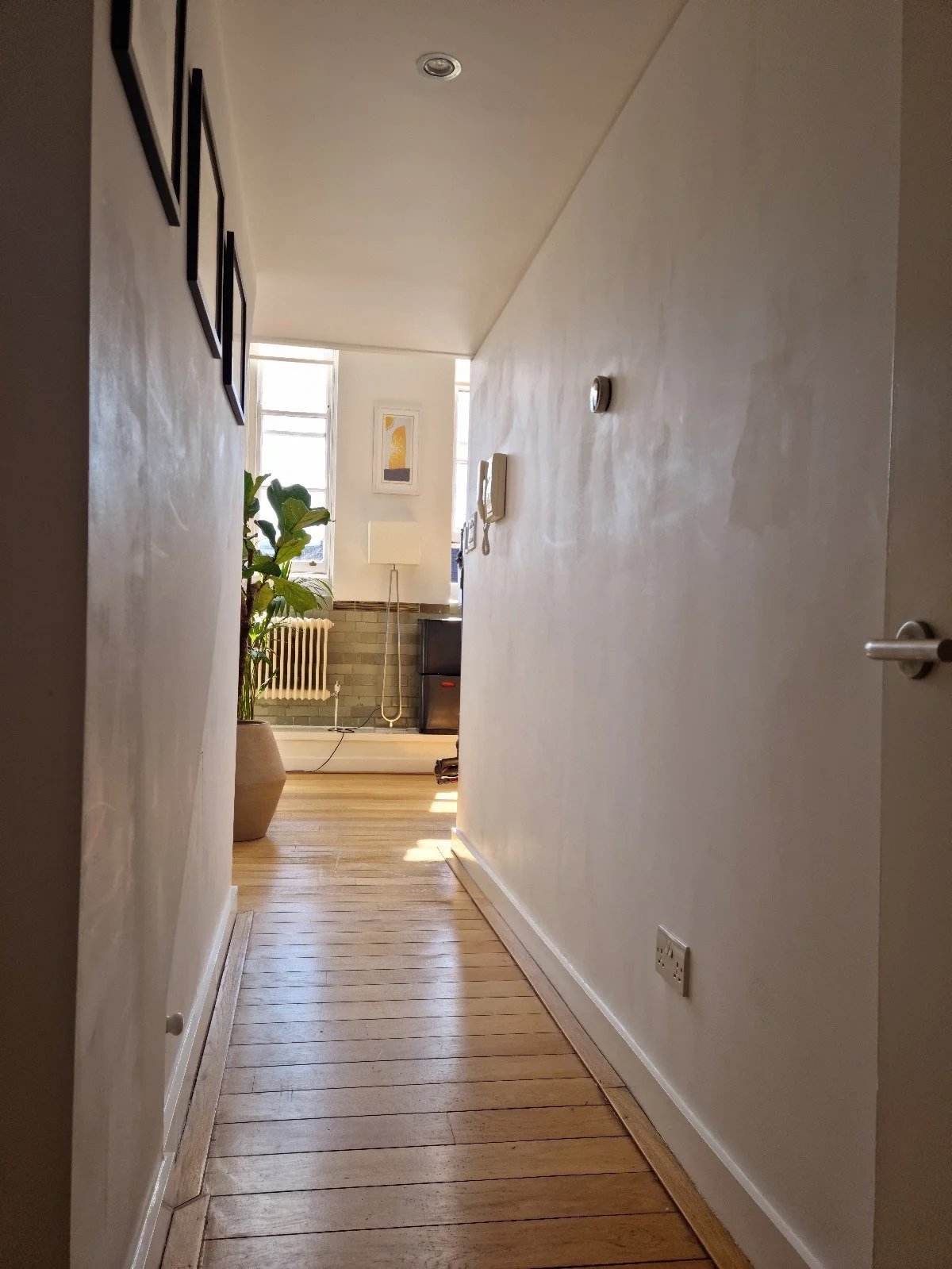
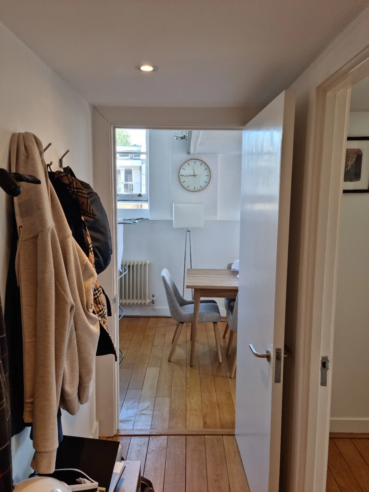
The hallway and corridor were where the layout problem was most acute. Hinged doors swung into the narrow space, blocking flow and reducing it to a series of obstacles. The original floorboards, worn, straight-laid, and dimensionally incompatible with the building's character, made the circulation route feel like a service passage rather than the heart of the home. The entire first floor could, as the clients noted, be navigated in a circle with no clear sense of arrival anywhere.
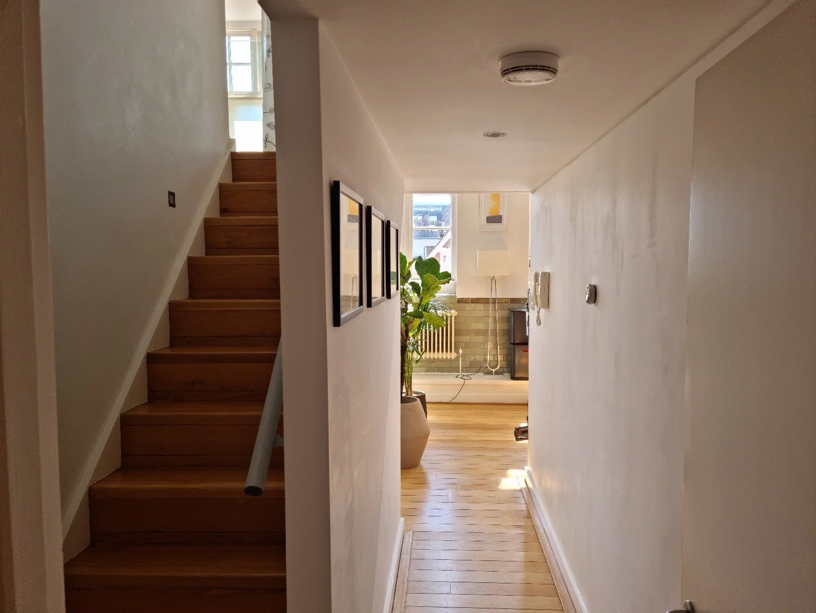
The staircase was plain timber with a chrome handrail bracket and no lighting. It connected the two floors without comment.
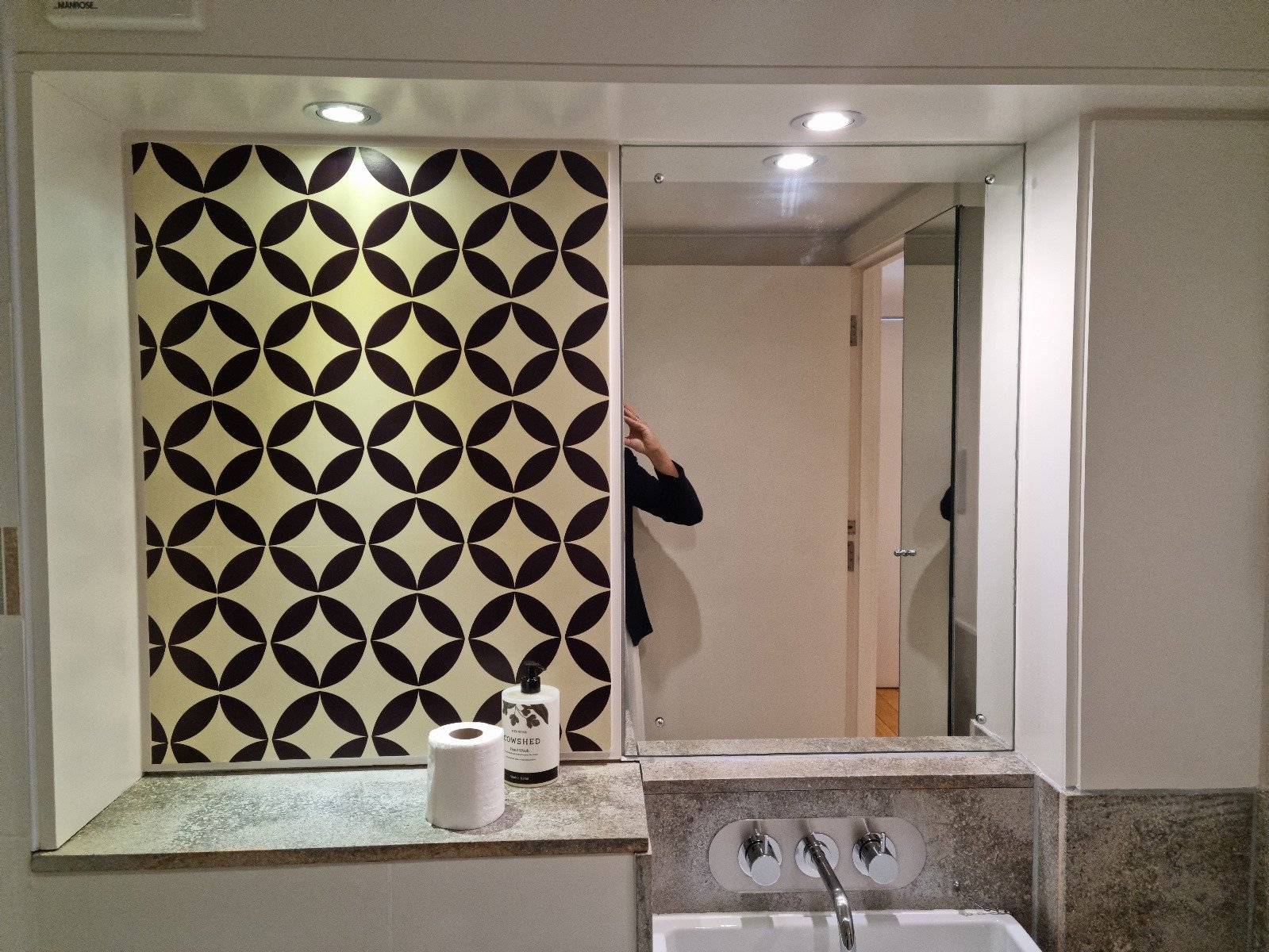
The bathroom offered a bold geometric patterned feature panel, granite worktop and chrome fittings, a combination of styles that had never resolved into a coherent scheme. It was a room where several design decisions had been made at different times and never reconciled.
The Brief: Create Order Without Losing the Building
The clients came to Studio Akiva with a precise understanding of what they needed: a cohesive open-plan living space with a practical kitchen and an inviting dining area; efficient built-in storage throughout; a mezzanine bedroom with proper privacy and natural light; and a Japandi aesthetic, the fusion of Japanese minimalism and Scandinavian warmth, that would allow the heritage features to be the dominant visual experience rather than competing with the decor.
It is, as briefs go, a masterclass in knowing what you want.
The Strategy: Create Rooms Without Building Walls
The central design challenge was how to introduce definition, privacy and hierarchy into the apartment without altering its essence. In a Grade II listed building, any structural intervention requires Listed Building Consent. In a space defined by its openness and volume, dividing walls would have been architecturally catastrophic regardless of planning constraints.
Studio Akiva's designer Ivana De Felice resolved this with a toolkit of non-structural interventions that are, in retrospect, obvious, and in practice, rarely deployed with this level of skill.
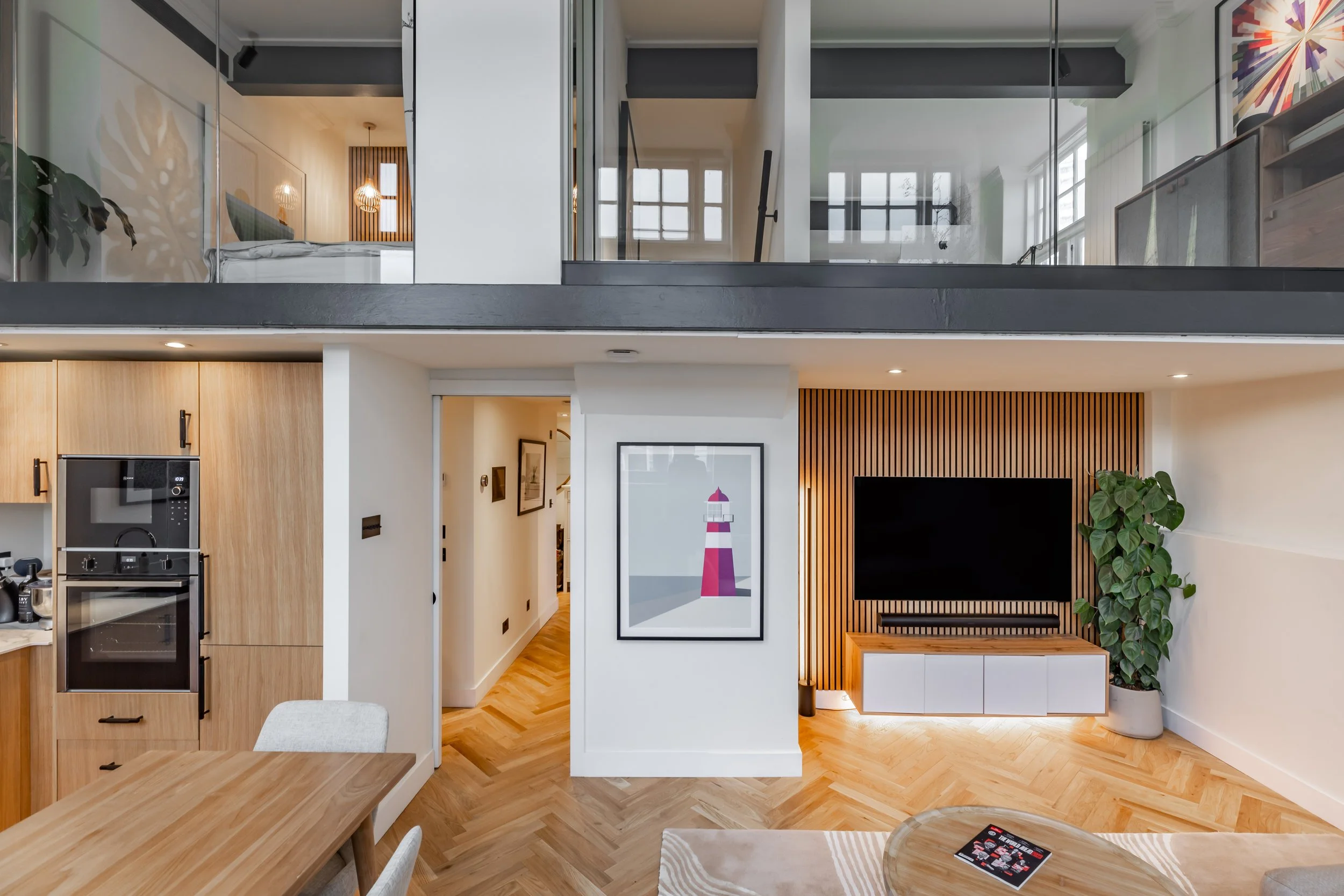
Pocket doors replaced all the existing hinged doors throughout the principal floor. Flush with the wall when open, they disappear entirely, preserving the sense of openness and flow. When closed, they create clearly defined rooms. The mechanism is invisible; the effect is transformative. The narrow corridor shown in the before photographs, where hinged doors were eating into the circulation space, becomes, in the finished apartment, a generous herringbone-floored hallway that flows naturally into every room.
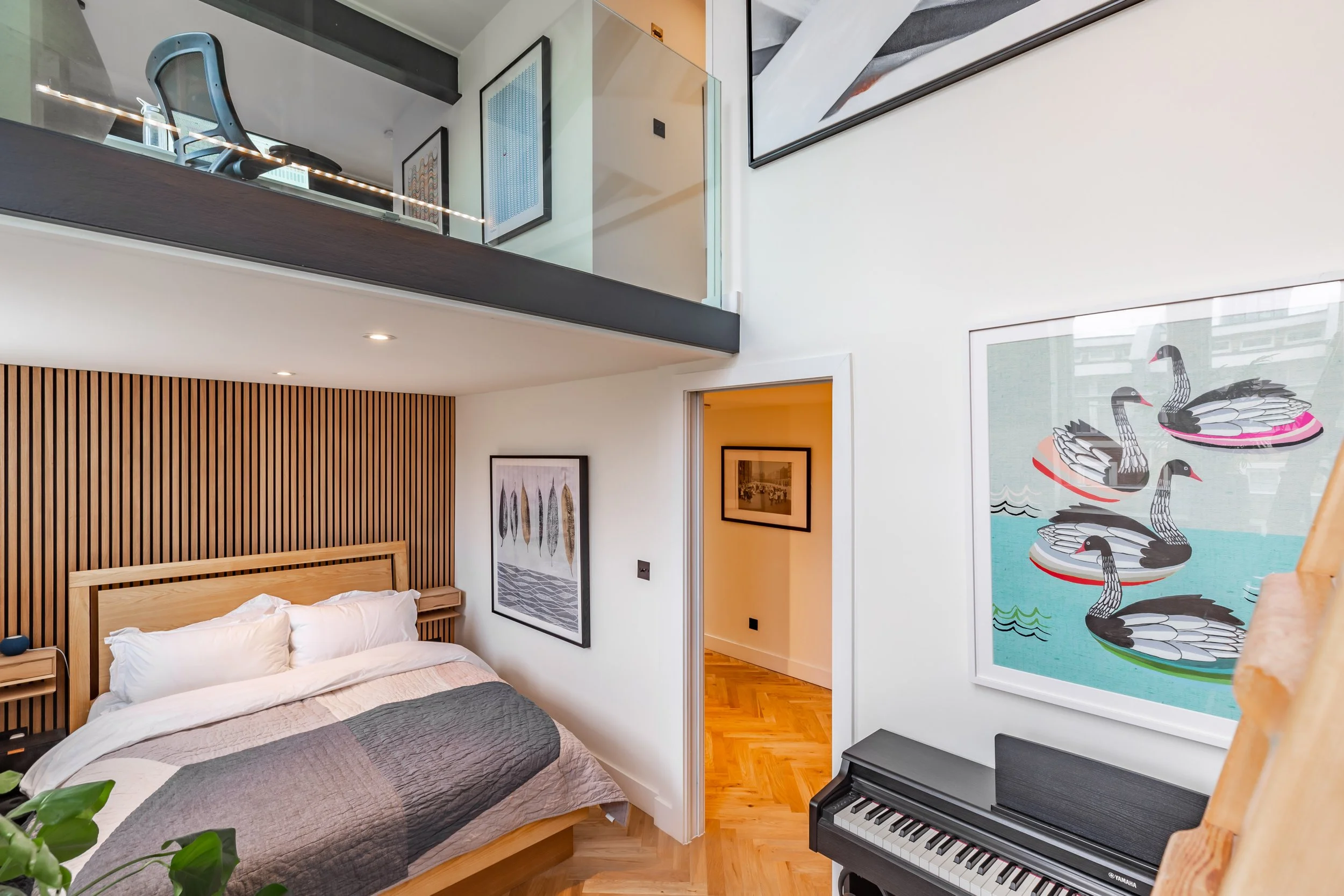
Glass partitions replaced the existing solid balustrade on the mezzanine. The privacy problem on the upper level was not one of proximity but of visual exposure: the bedroom was effectively open to the living floor below. A full-height glass wall structural, transparent, architecturally honest, created enclosure without blocking light. The mezzanine bedroom is now private. The double-height volume remains uninterrupted.
These are not complicated solutions. They are intelligent ones, and the distinction matters entirely.
The Floor: Where Everything Begins
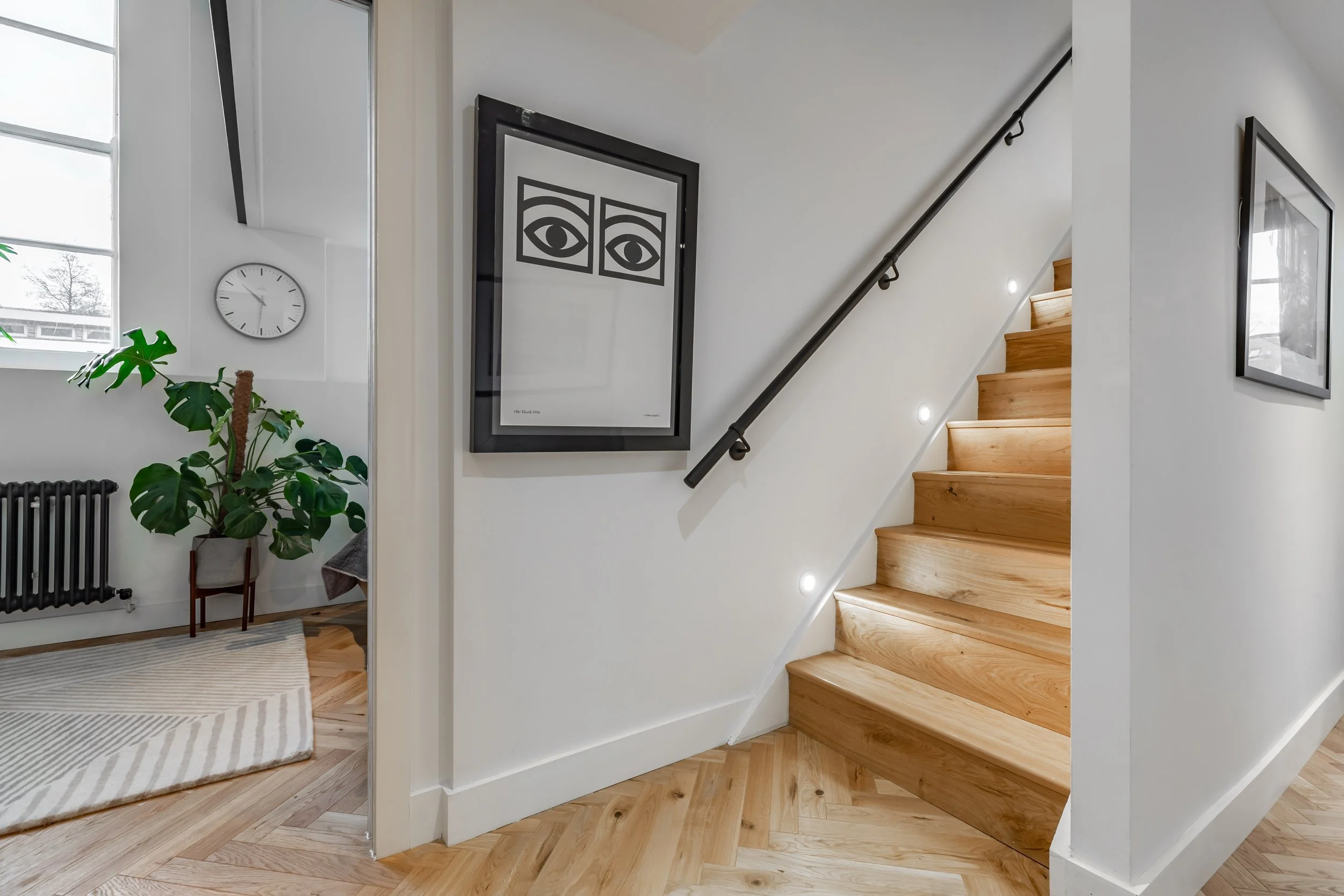
Before any room is discussed, the floor must be. The existing straight-laid boards were removed throughout and replaced with a herringbone oak parquet, a pattern specified to replicate the timber flooring of the building's communal corridors, connecting the apartment visually to the Grade II listed fabric it sits within.
The herringbone pattern introduces warmth, direction and a sense of craftsmanship that a straight-laid floor would never have achieved. It also creates a continuous visual ground that unifies the open-plan living, dining and kitchen zones without a single partition required. The staircase treads — solid oak, with recessed lighting at each step edge, carry the material upward, connecting both levels in the same language. Compare that staircase to the plain timber version in the before photographs and the transformation is immediate.
The Living Room: Industrial Heritage as Interior Feature
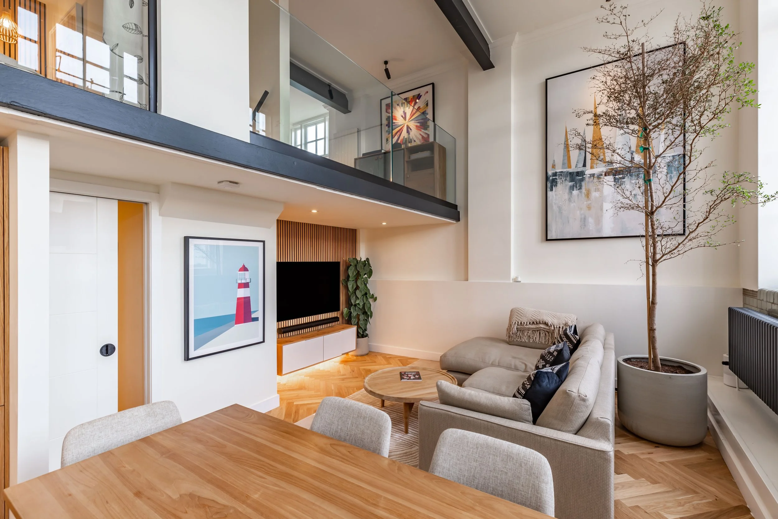
The living room has features that most London apartments would pay a considerable premium to acquire: a double-height volume, original glazed sage-green brick tiles running at dado height around the perimeter, cast iron column radiators, and tall sash windows that deliver light from two elevations. Studio Akiva's response was to leave them entirely alone, and then design everything else in relation to them.
The column radiators, previously cream and entirely unaddressed, were painted dark transforming them from functional afterthoughts into architectural features. The glazed dado tiles, which the before photographs show surrounded by mismatched furniture and trailing wires, now have a clear visual field in which to read. The warm white walls above allow the sage and herringbone floor to establish the palette without competition.
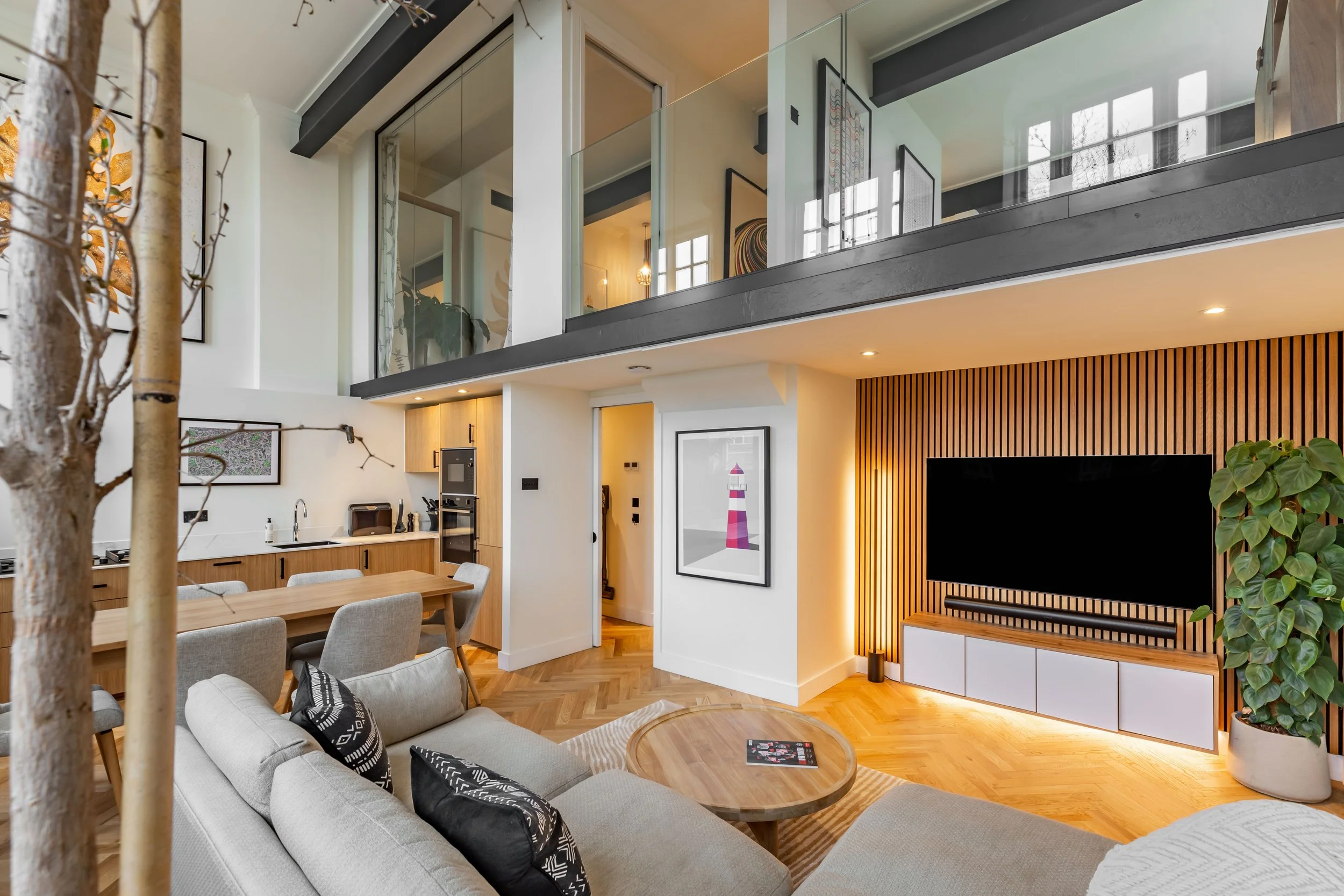
The oak slat feature wall that houses the television is the one major new element introduced into the living room, and it earns its place on several levels. It provides the room with a warm textural backdrop that references the Japandi aesthetic while grounding the television within a considered architectural frame. The amber backlighting transforms the wall in the evening, as the night shot makes plain, what reads as a clean material detail by day becomes the atmospheric centrepiece of the room after dark. The mezzanine bedroom glows warmly above through the glass balustrade, turning a functional element into a piece of domestic theatre.
The Kitchen: Functional, Beautiful, Invisible
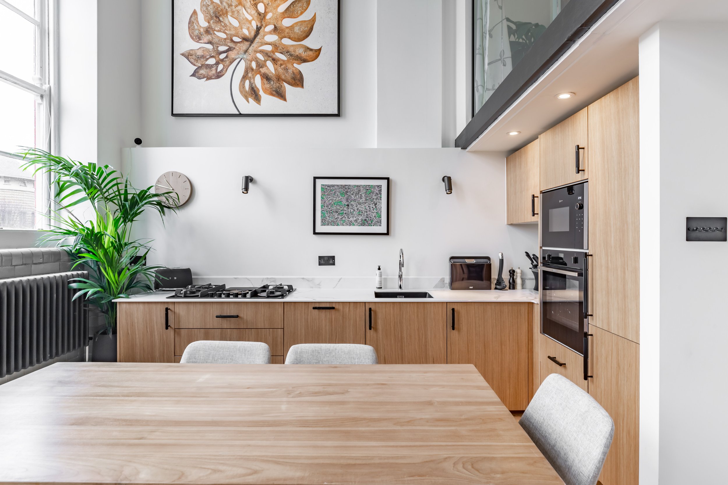
The previous kitchen was dark, wrong for the building, and lacked effective storage. The new design is a galley-style run of oak-effect cabinetry, warm, light-reflective and scaled correctly for the double-height volume it sits within. The cabinet doors are an oak-effect finish with matte black bar handles, sitting precisely at the intersection of Japandi restraint and contemporary practicality. The Calacatta-effect white quartz worktop and splash back introduce lightness and continuity.
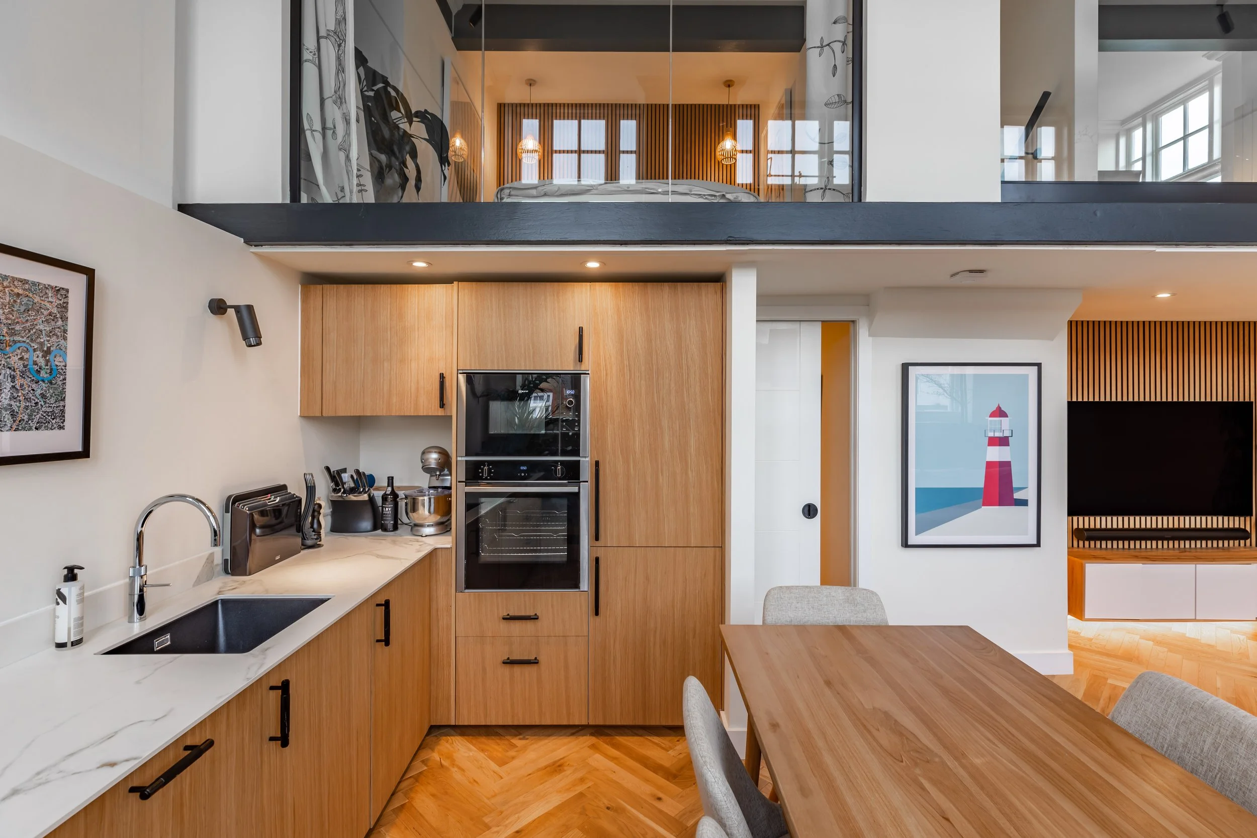
A Neff oven tower provides the appliance column the kitchen needed. Wall sconces above the worktop give task lighting at counter level. And the mezzanine bedroom, visible above through the glass balustrade, is now part of the kitchen's view, a connection between levels that the before photographs make no attempt at, and that the after photographs make feel entirely natural.
The Dining Room: Where Heritage and Contemporaneity Meet
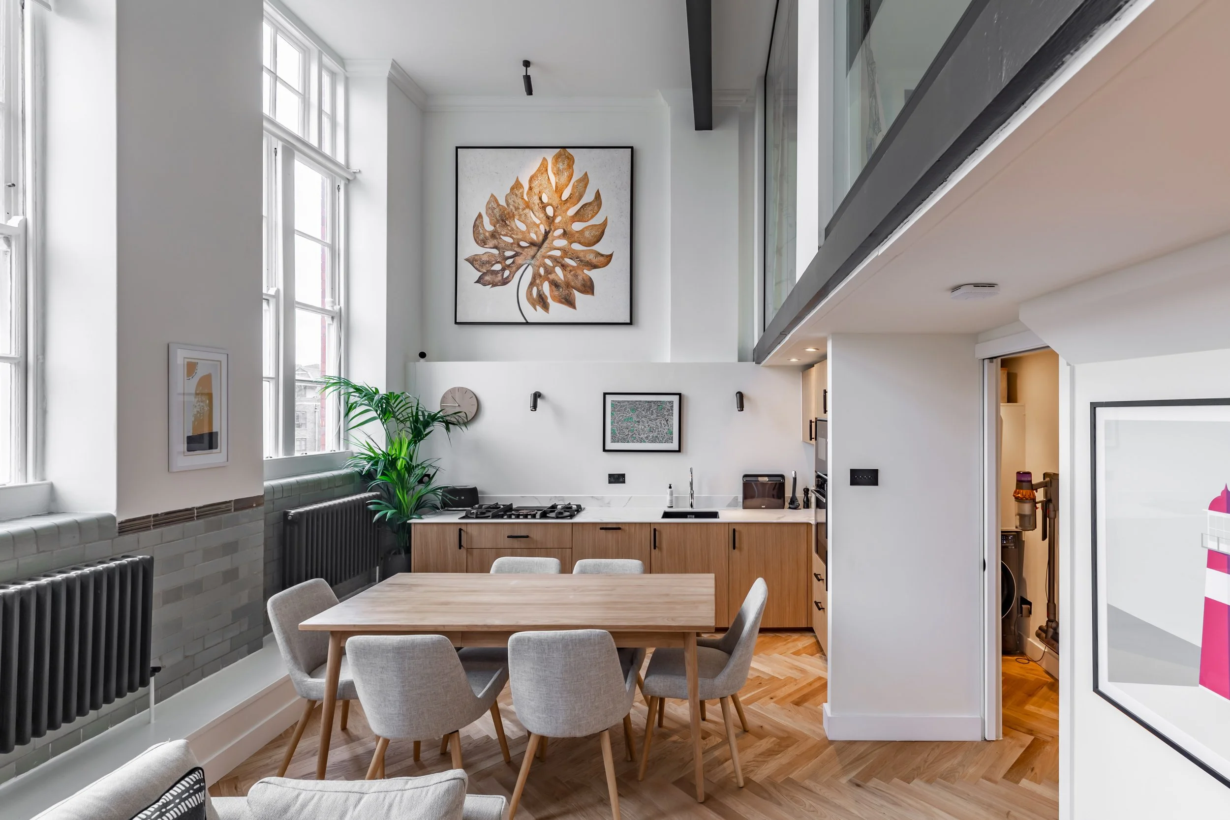
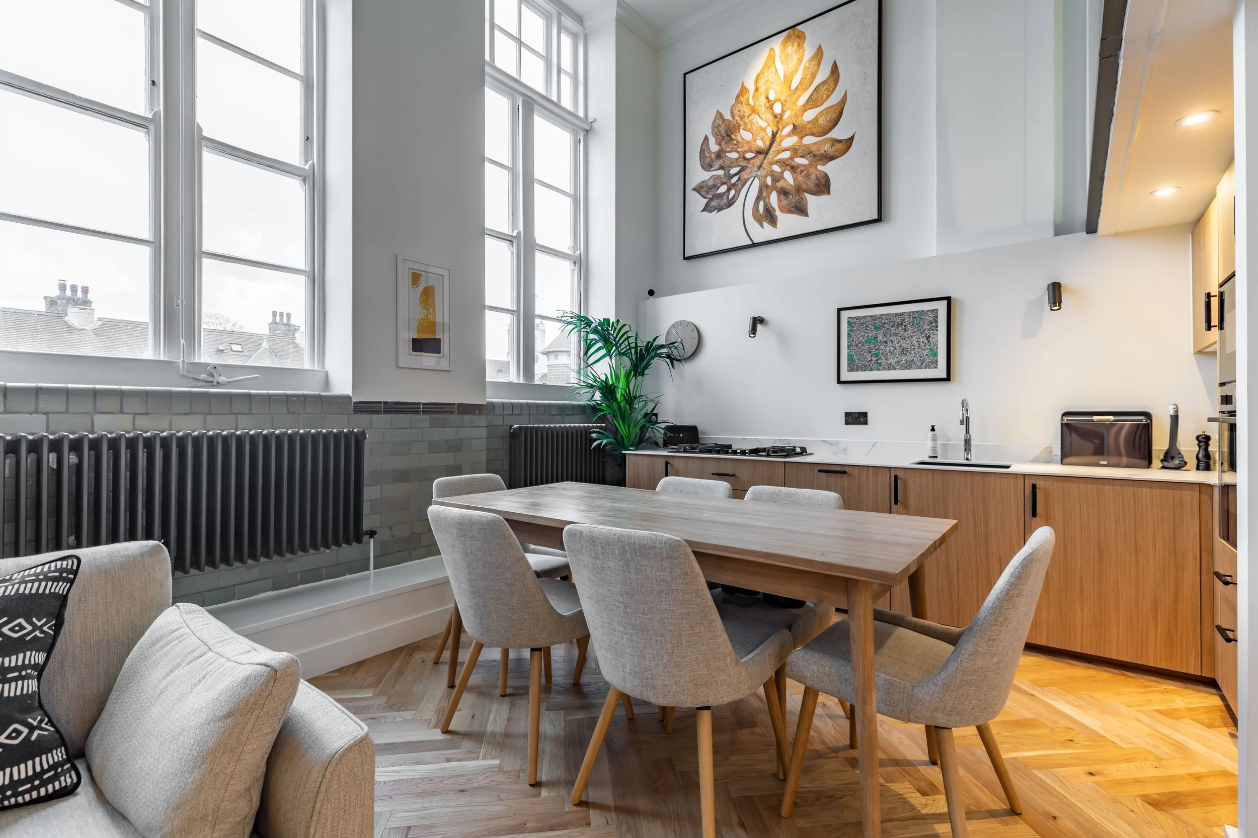
The dining area occupies the zone between the kitchen and the living room. The oak dining table and upholstered grey chairs are pieces of genuine quality. The original cast iron radiators and glazed dado tiles frame the space on the window wall. The golden monstera leaf artwork, hung at double-height scale on the wall above, gives the dining area its own visual anchor. This is a room that understands what it is for.
The Bespoke Bookshelf: Storage as Architecture
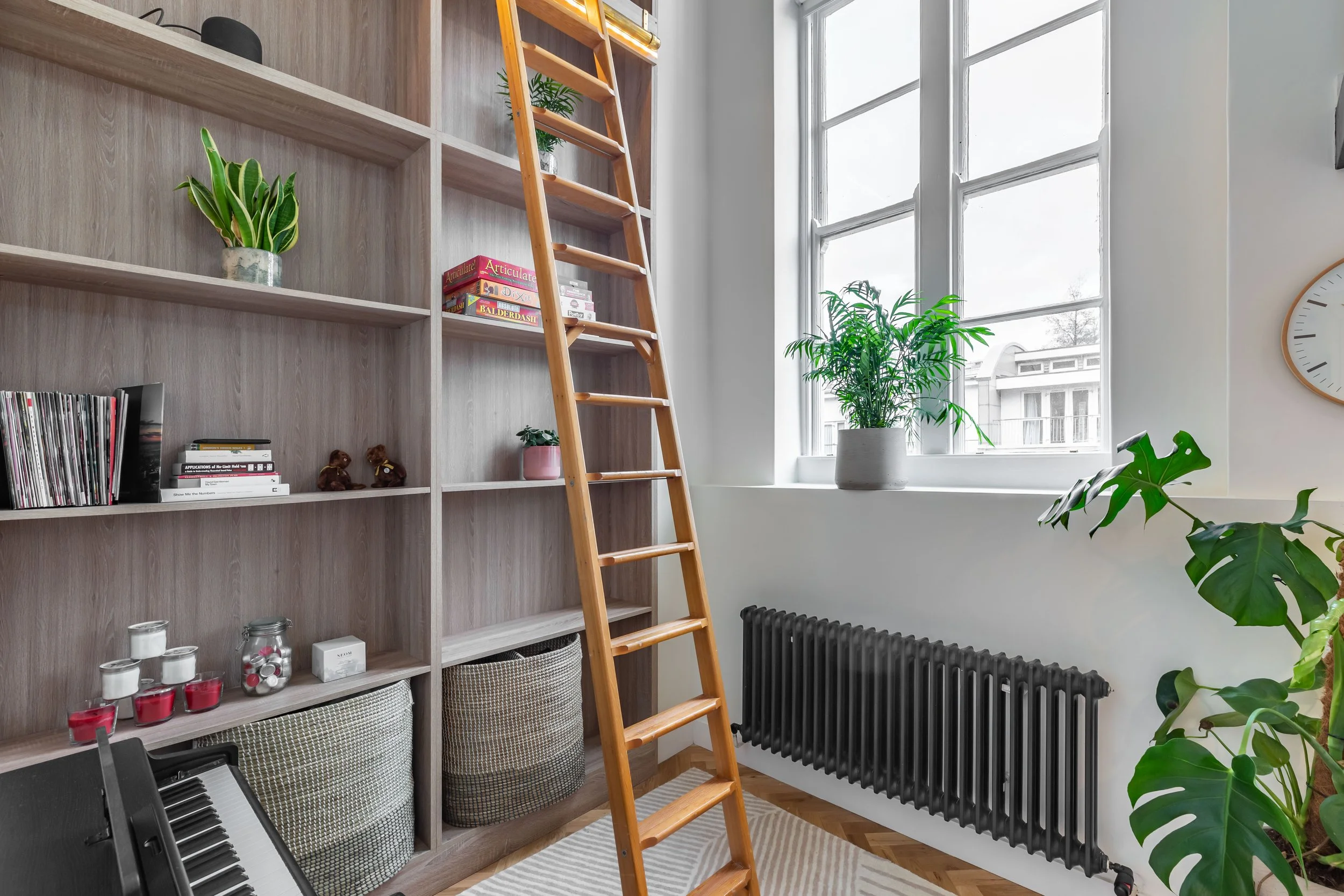
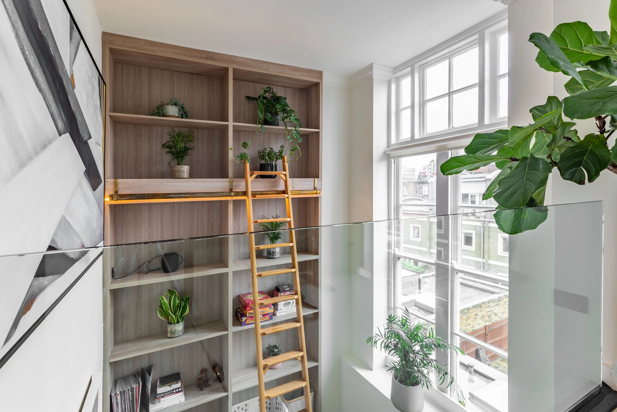
The bespoke full-height bookshelf is the project's most quietly spectacular element. Designed to replace a freestanding unit that had occupied the same position, it runs floor to the high ceiling, scaled to the building's original generous proportions rather than to conventional residential dimensions. A rolling library ladder provides access to the upper shelves — a reference that connects the apartment, with a certain wry elegance, to its educational past.
The Master Bedroom: A Room Within a Building
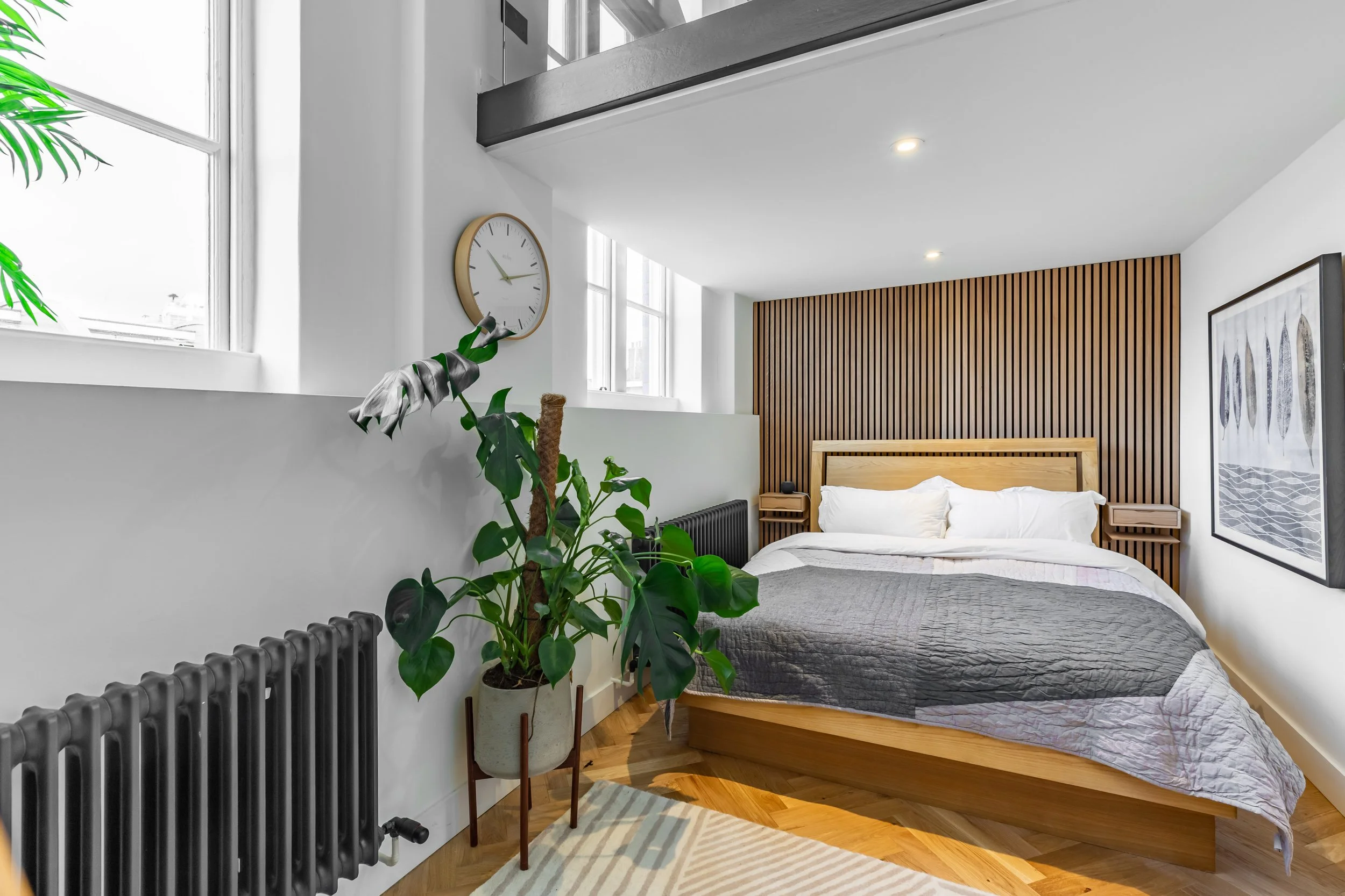
The master bedroom now occupies the mezzanine's principal zone, properly enclosed by the glass partition wall. The oak slat feature wall, running the full width behind the bed is warm where the building is cool, organic where the architecture is geometric. The herringbone floor continues from the level below. The original sash windows and column radiators, left intact, bring the character of the building into the most private room of the home.
The Bathrooms: Restraint as Luxury
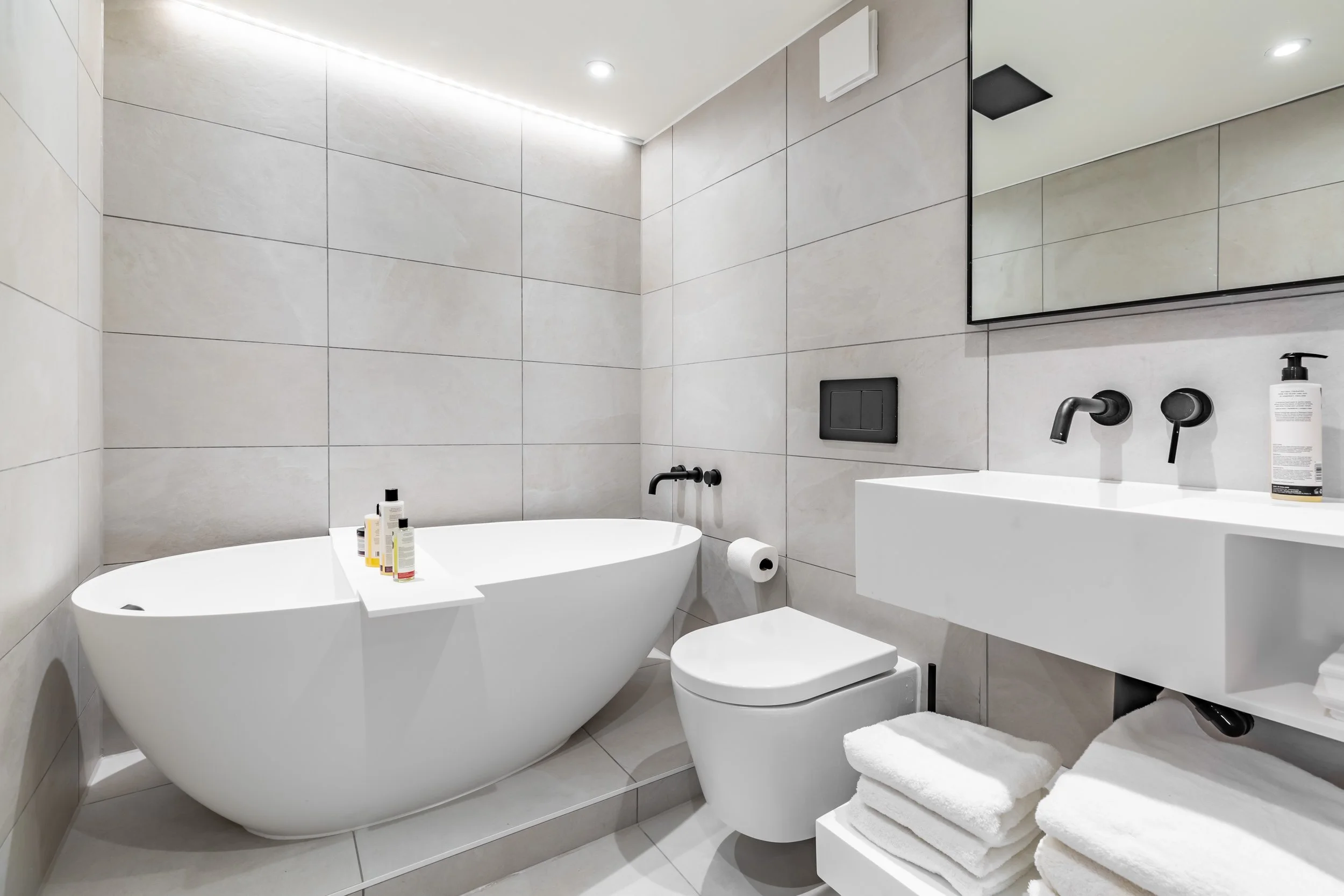
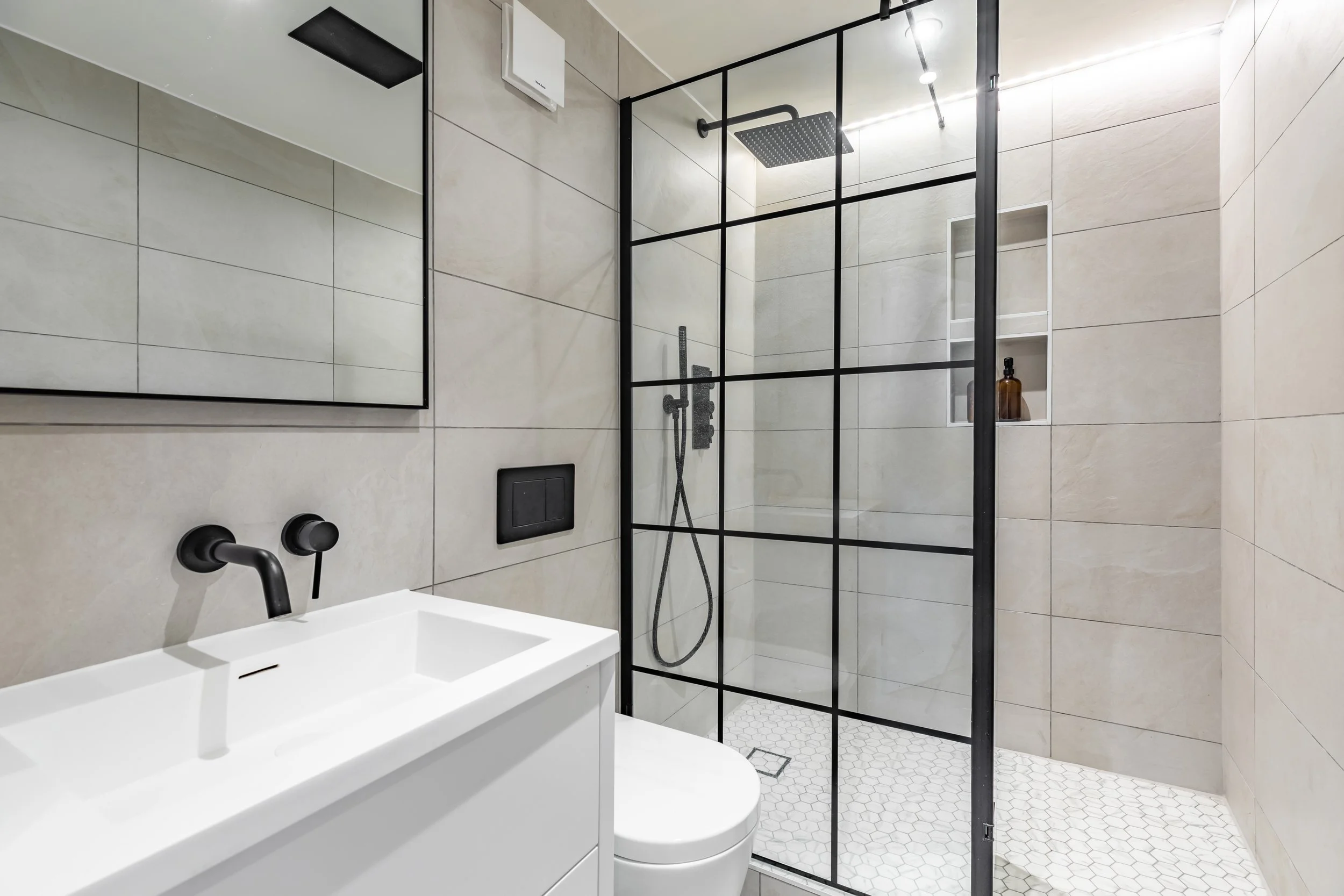
The contrast between the before and after bathrooms is among the sharpest in the project. The geometric patterned feature panel, the granite worktop and chrome fittings of the before have been replaced entirely. The main bathroom is now built around a freestanding white oval bath on a stepped plinth, large-format pale grey tiles, and matte black fittings throughout, maximum calm achieved through minimum intervention. The en-suite introduces the Crittall-style black-framed glass shower screen, pale stone-effect tiles, a hexagonal mosaic shower floor and a ceiling-mounted matte black rain shower head. Both are resolved, serene and entirely at one with the Japandi aesthetic running through the rest of the apartment.
The Mezzanine Office: The Heritage Bones Exposed
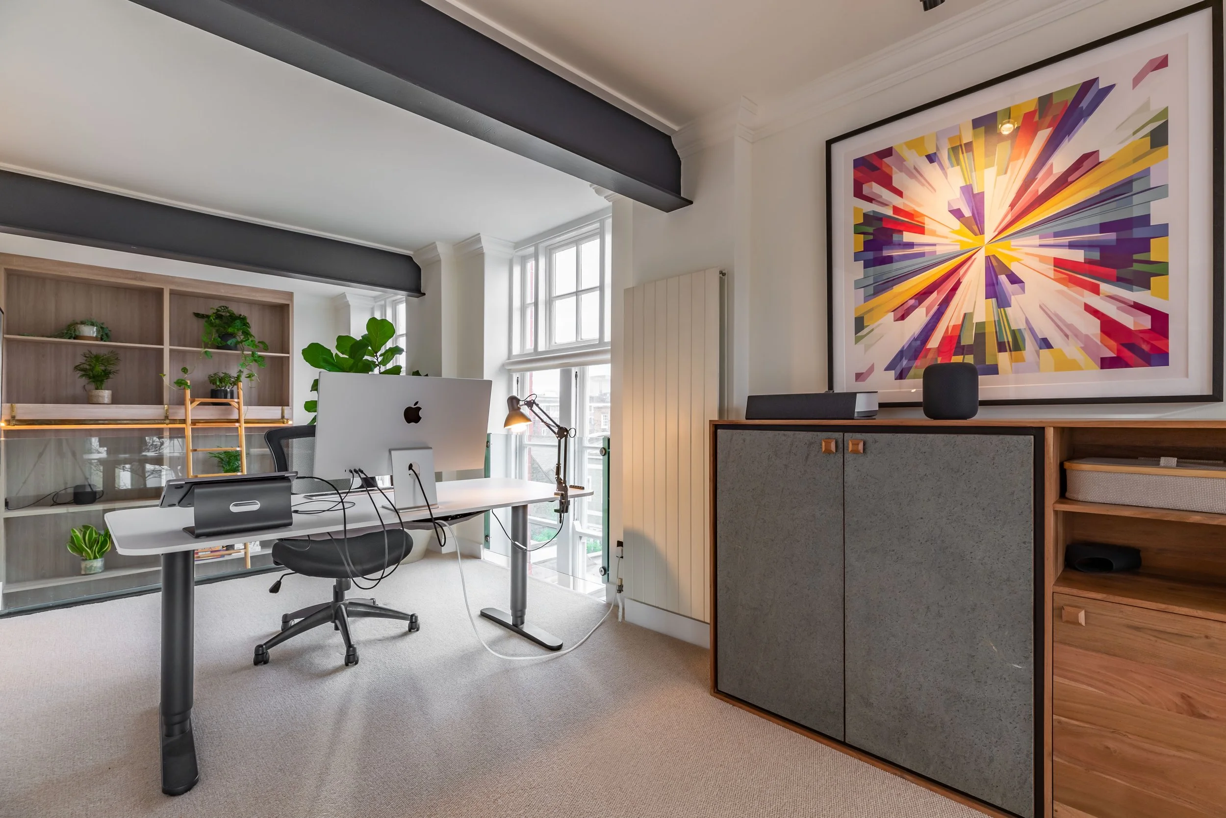
The mezzanine office is where the building's original structure is most nakedly visible. The wrought iron beams, retained from the boarding school's original construction have been painted dark and left exposed. They are not disguised or apologised for. They are celebrated, because they are the reason the apartment is what it is.
What The Kingsway Teaches Us About Listed Building Design
There is a tendency, in discussions of listed building interiors, to treat the heritage constraints as obstacles to good design. This project demonstrates the opposite: that constraints, properly understood, are the conditions under which the best design happens.
The wrought iron beams, the glazed tiles, the sash windows, the double-height volumes these are not problems to be solved. They are the brief. Everything else, the Japandi palette, the pocket doors, the glass partitions, the oak floors, the bespoke joinery exists in service of making those inherited elements more present, more legible, more beautiful in the context of a genuinely contemporary home.
The result is a duplex that feels both entirely of its building and entirely of its time. That is, for a listed building renovation, the only possible definition of success.
Planning a Renovation in a Listed Building or Historic Conversion?
Studio Akiva has designed homes in listed buildings, school conversions and period properties across London, approaching each one with the same fundamental question: what is the building already telling you?
If you have a listed property, a historic conversion, or any home where the architecture is the starting point rather than the backdrop, begin the conversation here.
Explore the full Kingsway project gallery at studioakiva.com/residential-design/the-kingsway and our full residential interior design services.