 Image 1 of 2
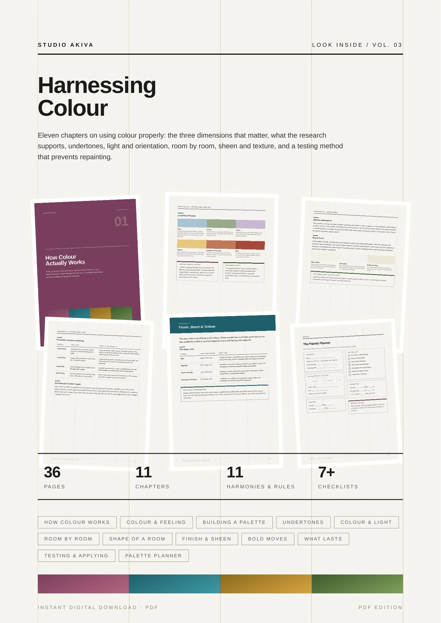 Image 2 of 2
How hue, tone and undertone shape a room, and how to build palettes that hold together.
Colour reaches people before
anything else in the room.
Before the furniture, before the layout, before they have consciously registered anything at all. Which is why getting it wrong is so expensive, and getting it right feels like the room was always meant to look that way.
Research, honestly handled
What studies on colour and mood actually show, including where the effects are real and where popular claims run well past the evidence.
The dimension nobody mentions
Most advice is about hue. Saturation and value do more of the work, and this guide shows you how to use them.
Light, taken seriously
Orientation, bulb temperature, reflected colour and time of day, because the same tin of paint is a different colour in every room.
A testing method that works
An evening with sample boards instead of a weekend repainting, plus the arithmetic for buying the right amount.
- 01How Colour Actually WorksHue, saturation and value, plus Light Reflectance Value and why it is the most useful number in decorating.
- 02Colour and FeelingWhat the research on colour and mood genuinely supports, and the confident claims it does not.
- 03Building a PaletteThe 60-30-10 structure, four harmonies worth knowing, and a thread that runs through the whole home.
- 04Undertones, Whites & NeutralsWhy your perfect white looks dirty next to the sofa, and how to find an undertone in three ways.
- 05Colour and LightNorth, south, east and west, bulb temperature, reflected colour, and how to judge a shade honestly.
- 06Colour Room by RoomWhat each room needs, connecting spaces, open plan, and windowless rooms.
- 07Colour and the Shape of a RoomUsing value to change proportions, lower a ceiling, shorten a corridor or hide awkward architecture.
- 08Finish, Sheen & TextureThe sheen scale from matt to gloss, specialist finishes, and how texture changes a colour.
- 09Bold MovesColour drenching, feature walls that work, joinery, ceilings, and where to take a risk cheaply.
- 10What Lasts and What DatesWhy some colours age well, where to put a trend, and what to do if resale matters.
- 11Testing, Buying & ApplyingThe sample board method, how much paint to buy, and the order of work.
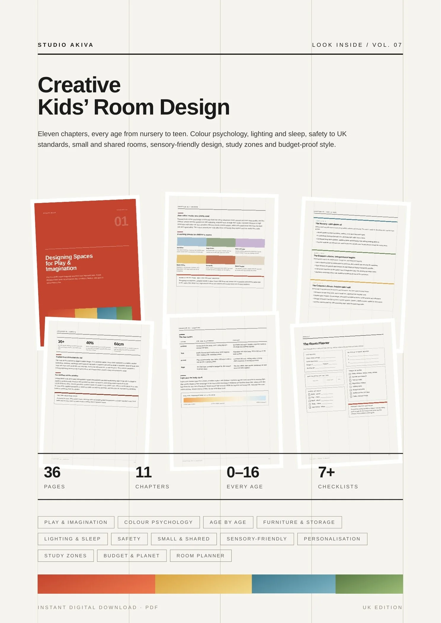
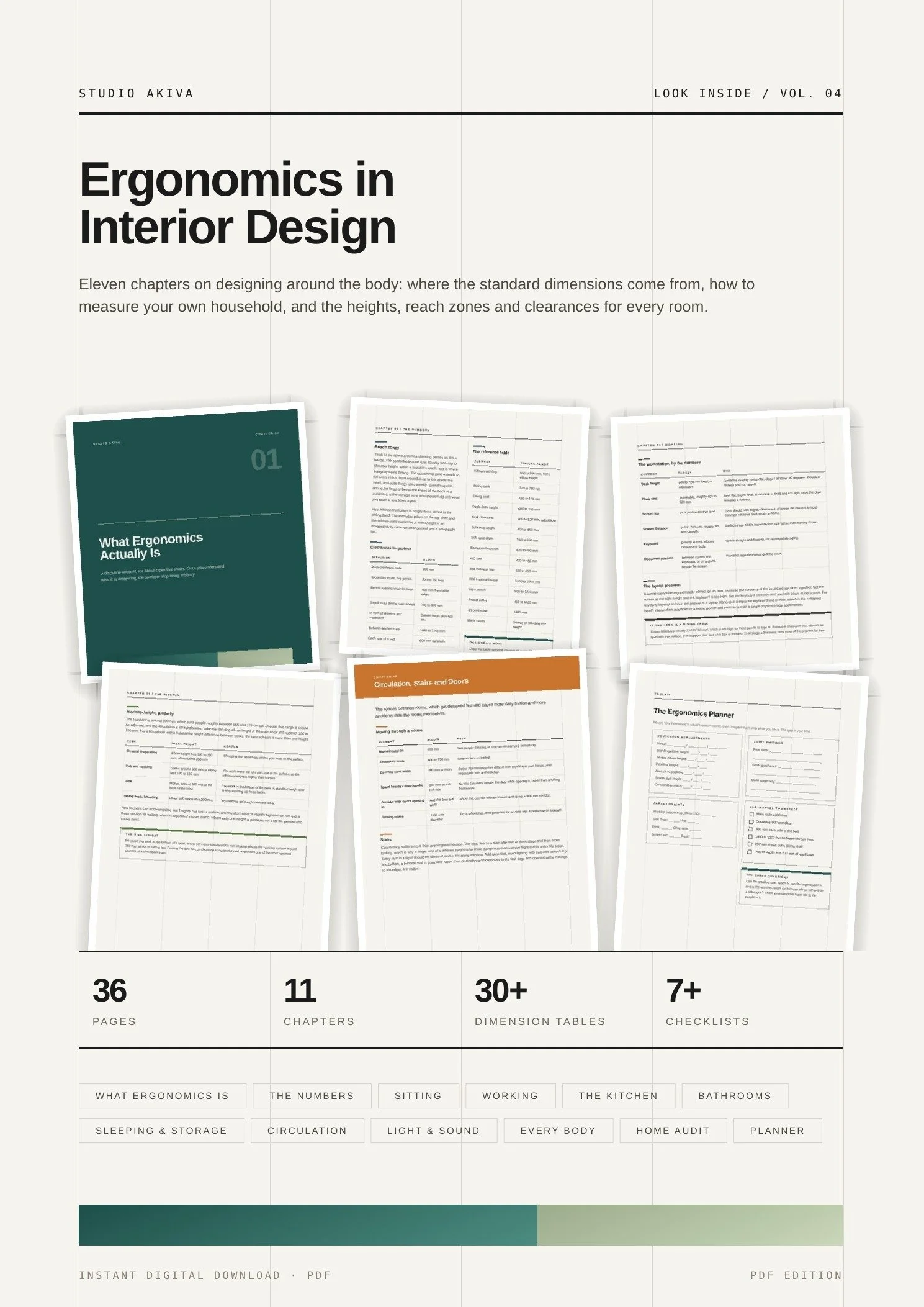
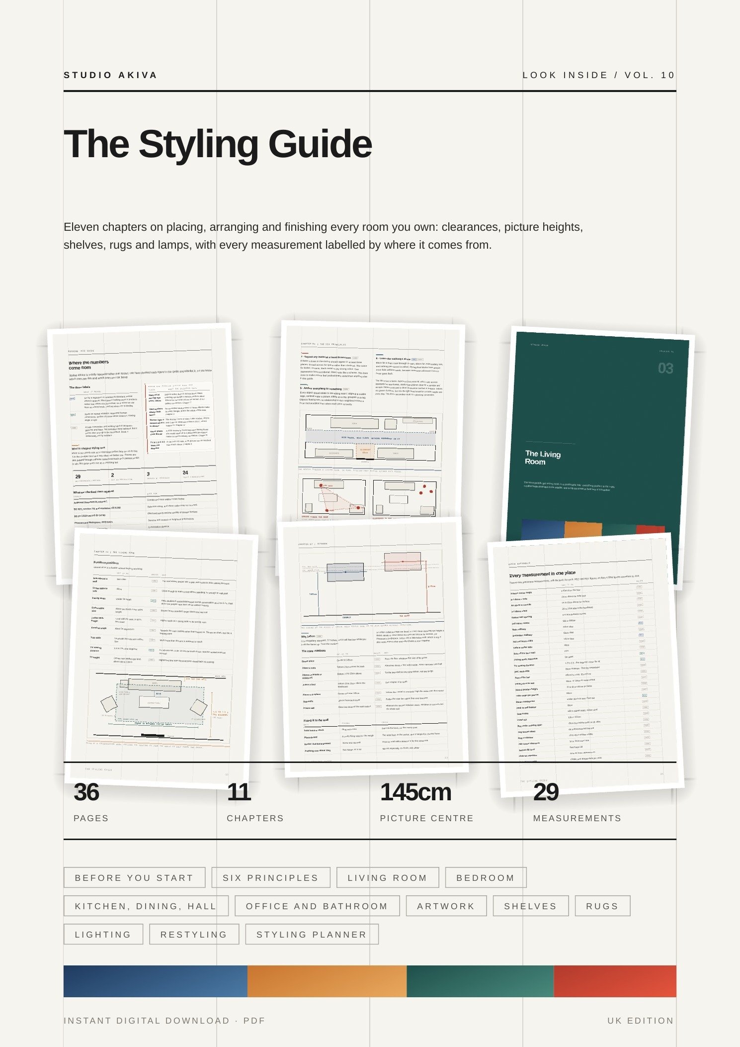
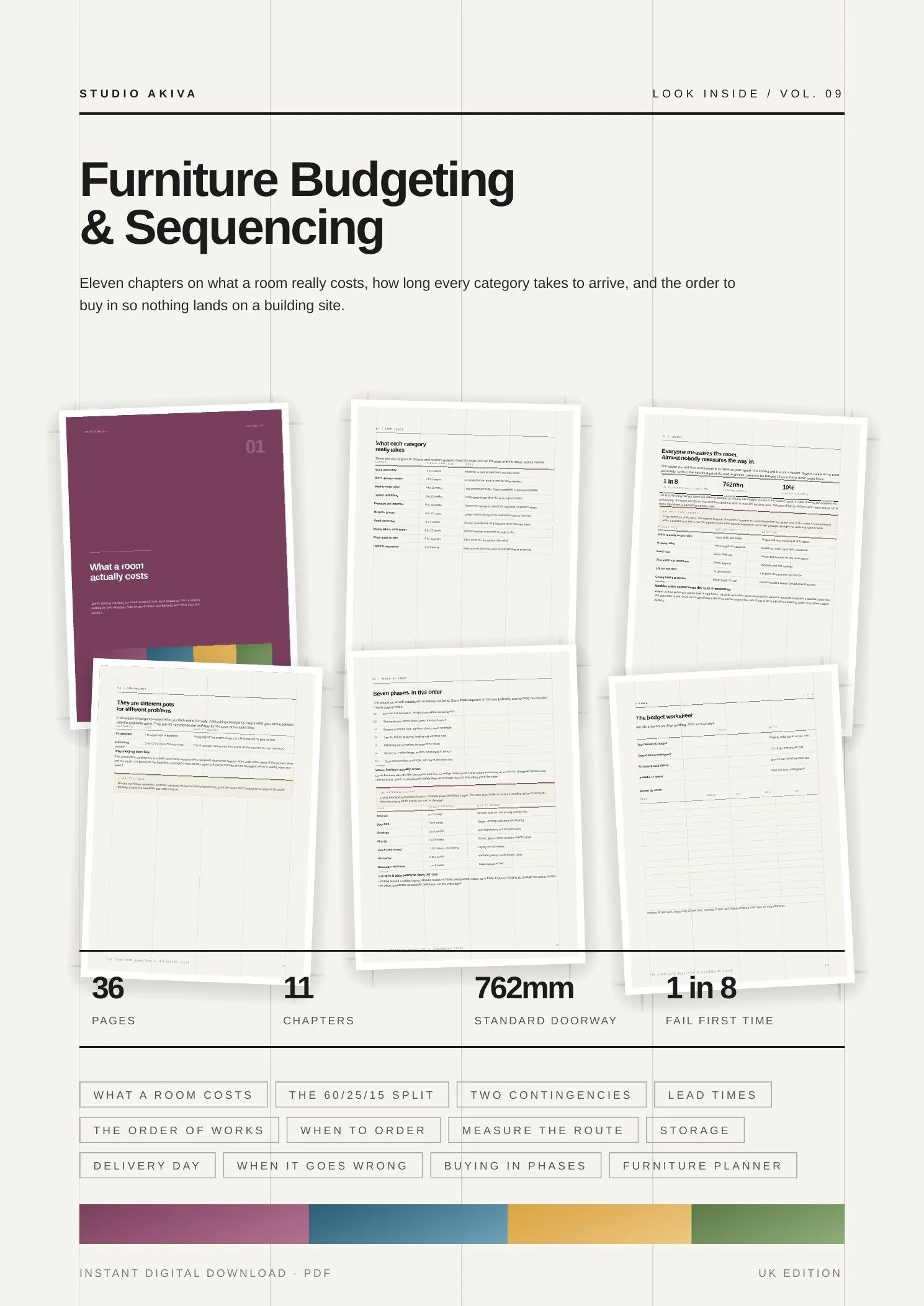
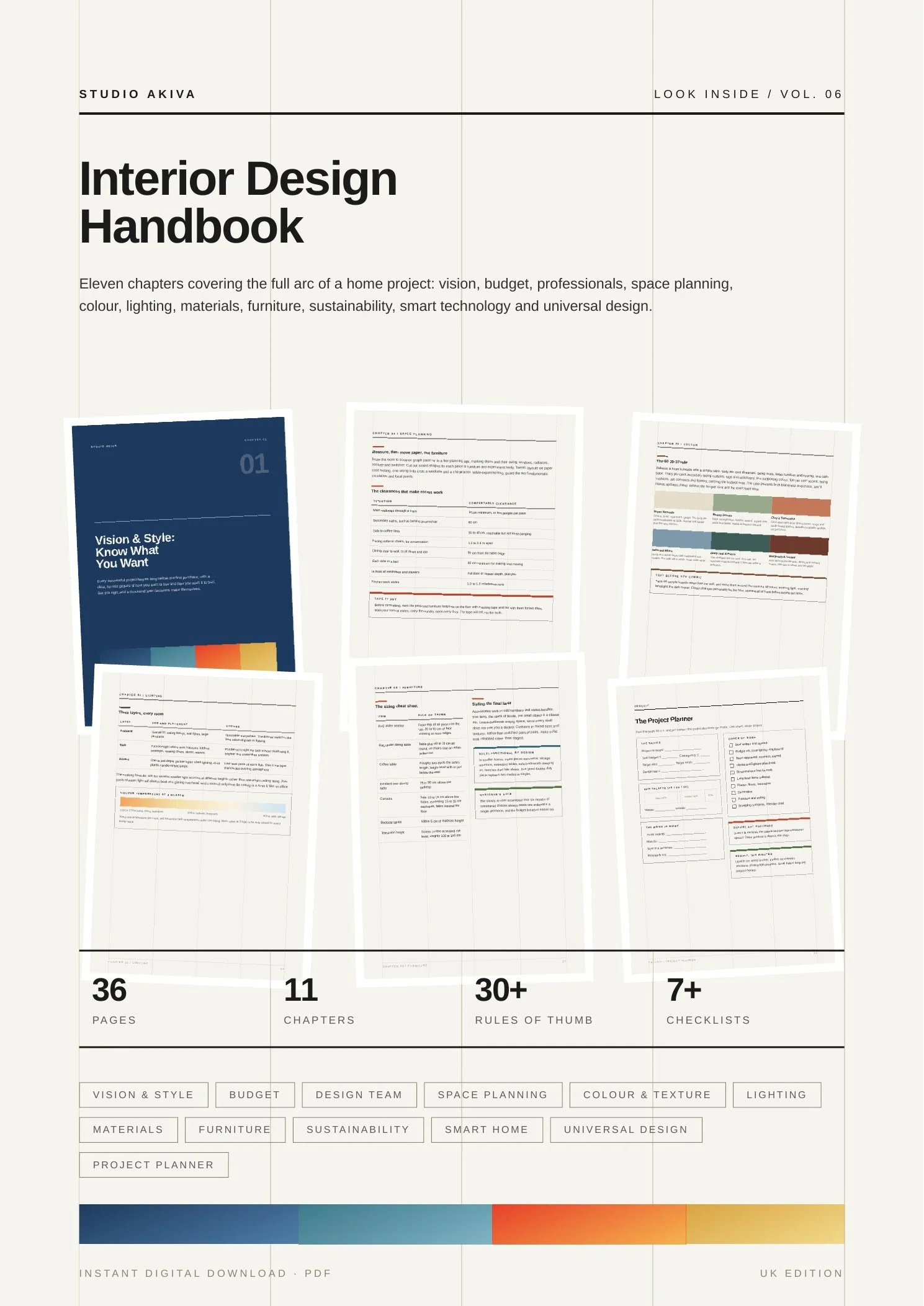
A look at how the guide is laid out. Every chapter pairs plain-English guidance with something you can act on, a table, a checklist or a worksheet.
 In the guide
 In the guide
 In the guide
 In the guide
 In the guide
 In the guide
One edition, everywhere
Colour behaves the same wherever you live, so unlike our renovation guides there is no separate UK and EU version. The light and orientation guidance is written for the northern hemisphere, and simply reverses north and south below the equator.
Add to basket using the button at the top of this page. Your download link arrives by email straight after checkout.
What format is it?
A 36-page A4 PDF. You get a download link by email straight after checkout, and you can read it on any device or print it at home.
Is this UK specific?
No. Colour behaves the same everywhere, so this is a single edition. The light and orientation guidance in Chapter 5 is written for the northern hemisphere, and simply reverses north and south below the equator.
Do I need to know anything already?
No. Chapter 1 starts with what colour is actually made of. If you have only ever picked shades off a card, that is exactly who this is written for.
Will it tell me which colours to use?
It will teach you how to choose, which is more useful and lasts longer. There are worked palettes and room by room guidance throughout, but the point is that you finish able to make the decision yourself.
Want a second opinion on your palette?
Studio Akiva is an award-winning London interior design studio. If you would rather talk your scheme through with someone, book a free fifteen-minute discovery call.